Roundsquare Rebranding
Challenge
By 2023, Samyang had changed faster than its corporate identity.
The business was expanding beyond its image as a legacy Korean food company, both globally and into new areas of growth. It needed a corporate brand that could connect 60 years of history with a much broader future — and bring different businesses together under one clearer idea.
My role
I led the corporate brand transformation from HQ, covering the new name and brand concept, corporate identity, visual system, rollout and internalization.
Working with Pentagram, Cheil and internal teams, I coordinated the process across senior management and group affiliates, translating the business direction into a brand system that could actually be used across the organization.
Strategy
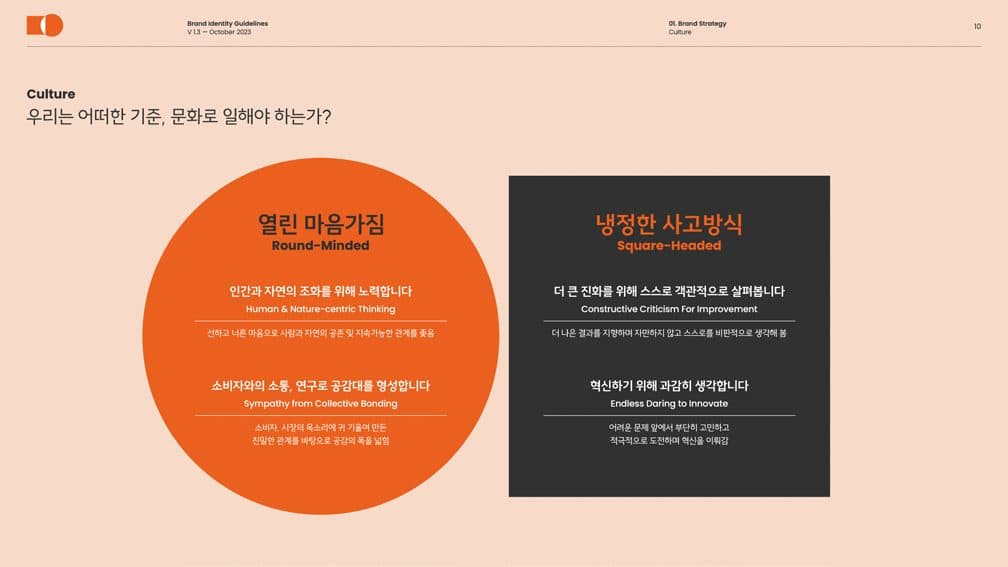
The idea of Round + Square became the foundation of the identity.
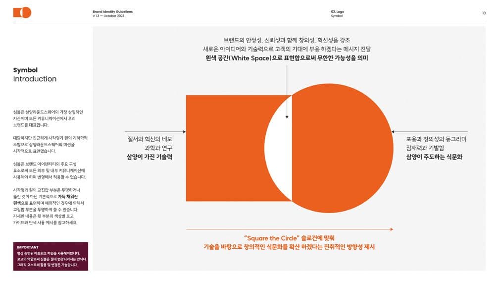
Round represented the more human side of the business — food, culture and connection. Square represented science, structure and innovation.
Rather than treating the project as a logo redesign, we built a broader corporate system covering typography, colour, affiliate architecture, signage, offices and production sites, applications, packaging templates and internal guidelines.
Impact
Samyang Roundsquare launched in 2023 as the group’s new corporate identity and became the common system across affiliates and corporate touchpoints.
Beyond visual consistency, the project gave a changing organization a clearer language for how it wanted to present itself — internally as well as externally.
Logo
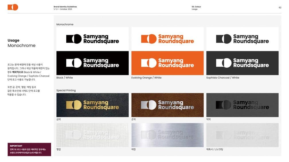
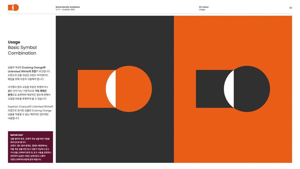
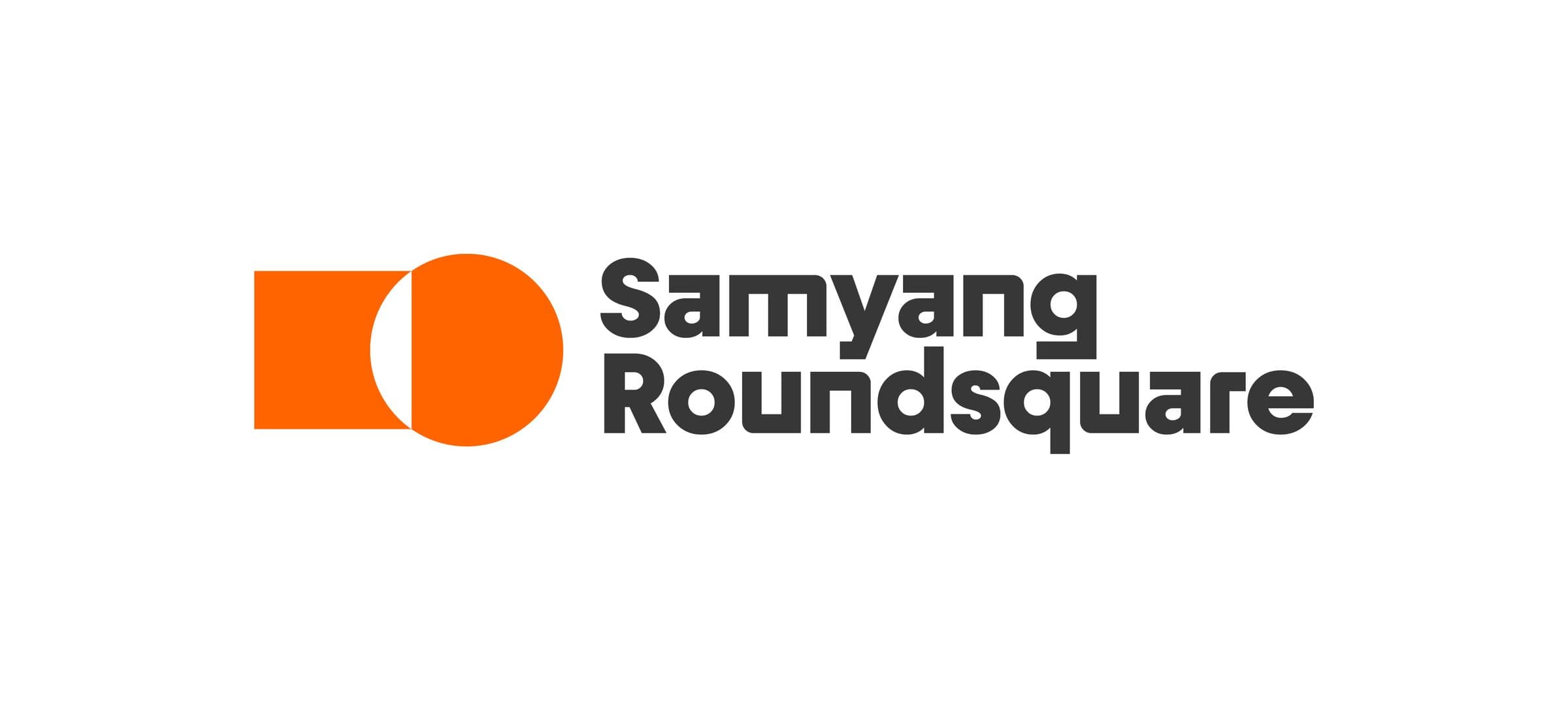
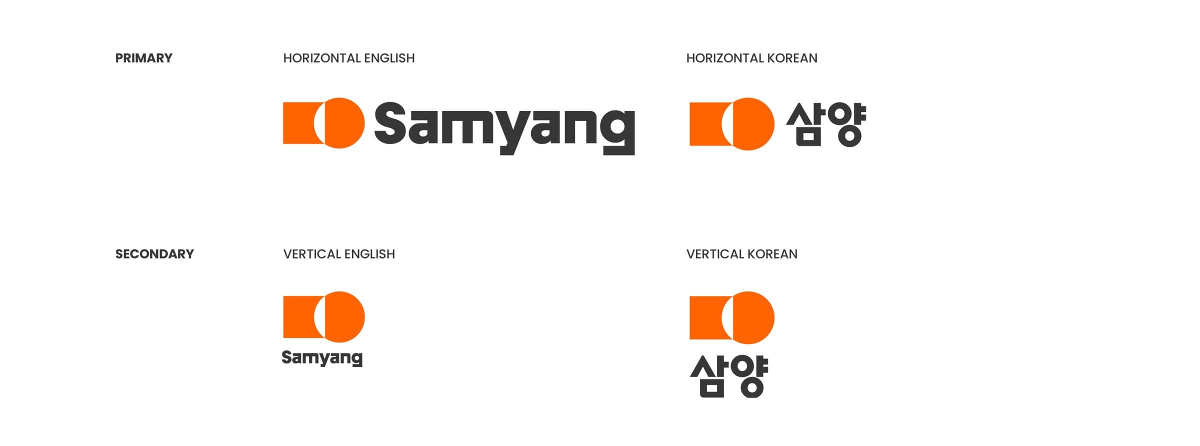
The new CI is the single largest asset representing the brand across every communication. The symbol, a geometric composition of square and circle, is at once bold and approachable. It stands for visual balance, harmony and connection, and carries Samyang Roundsquare’s forward intent to spread a creative food culture built on technology.
Lockups
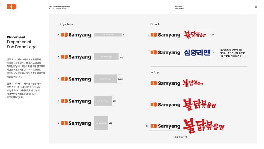
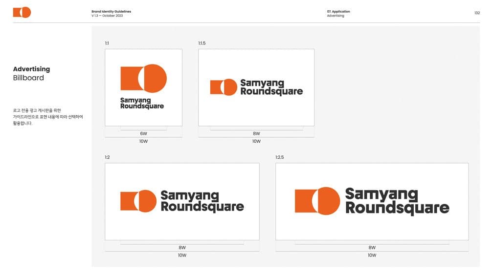
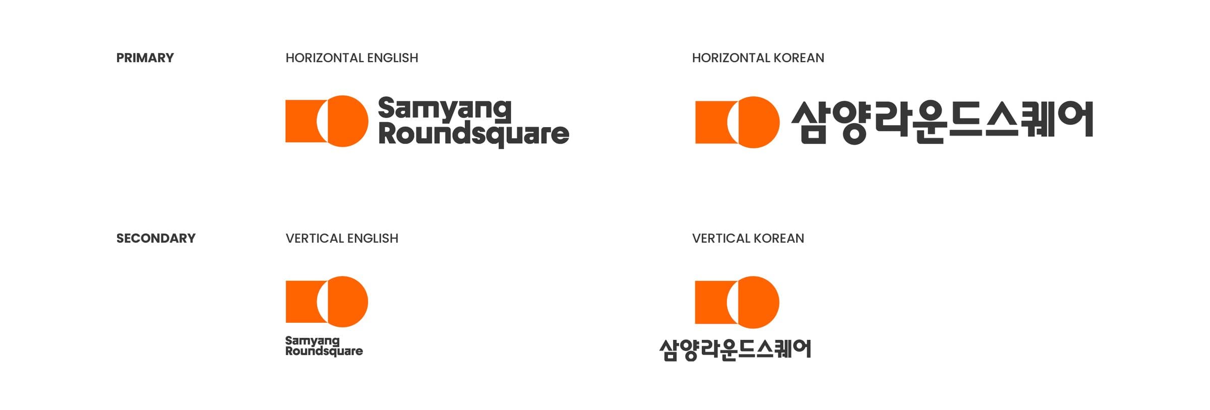
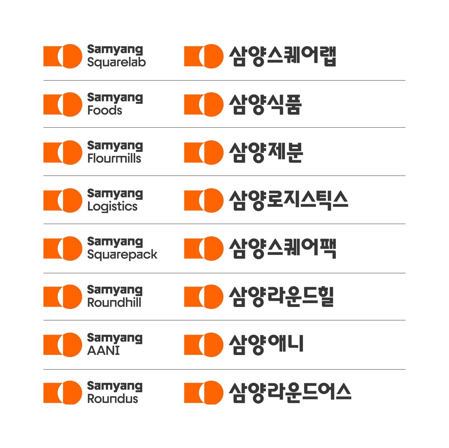
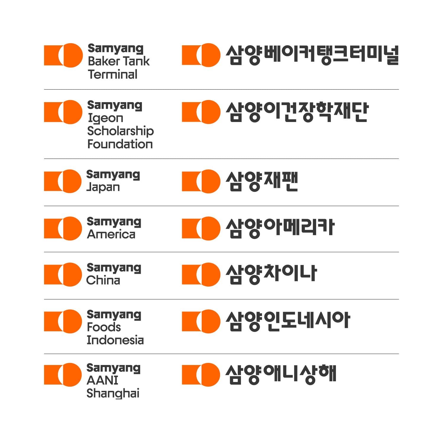
With the brand symbol at the centre, every affiliate takes the same proportional form, holding the architecture consistent throughout. Diverse business areas read as one, reinforcing the brand identity and building a visual identity particular to Samyang Roundsquare.
Font
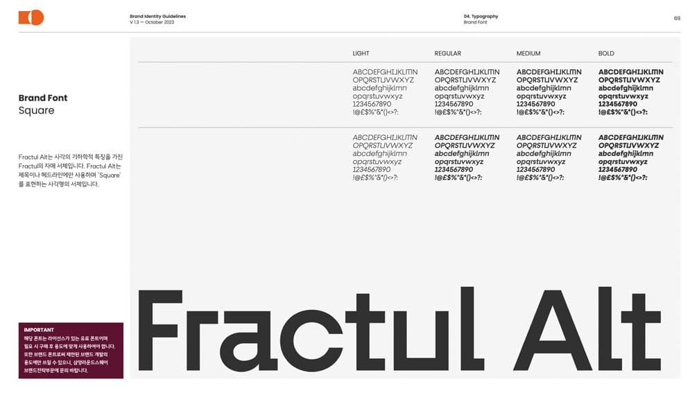
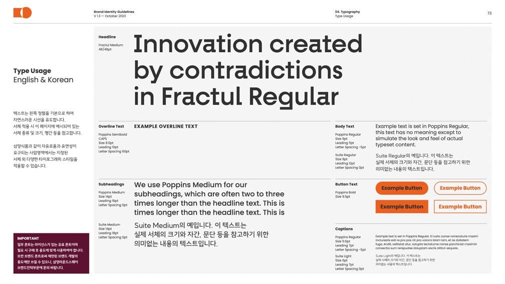
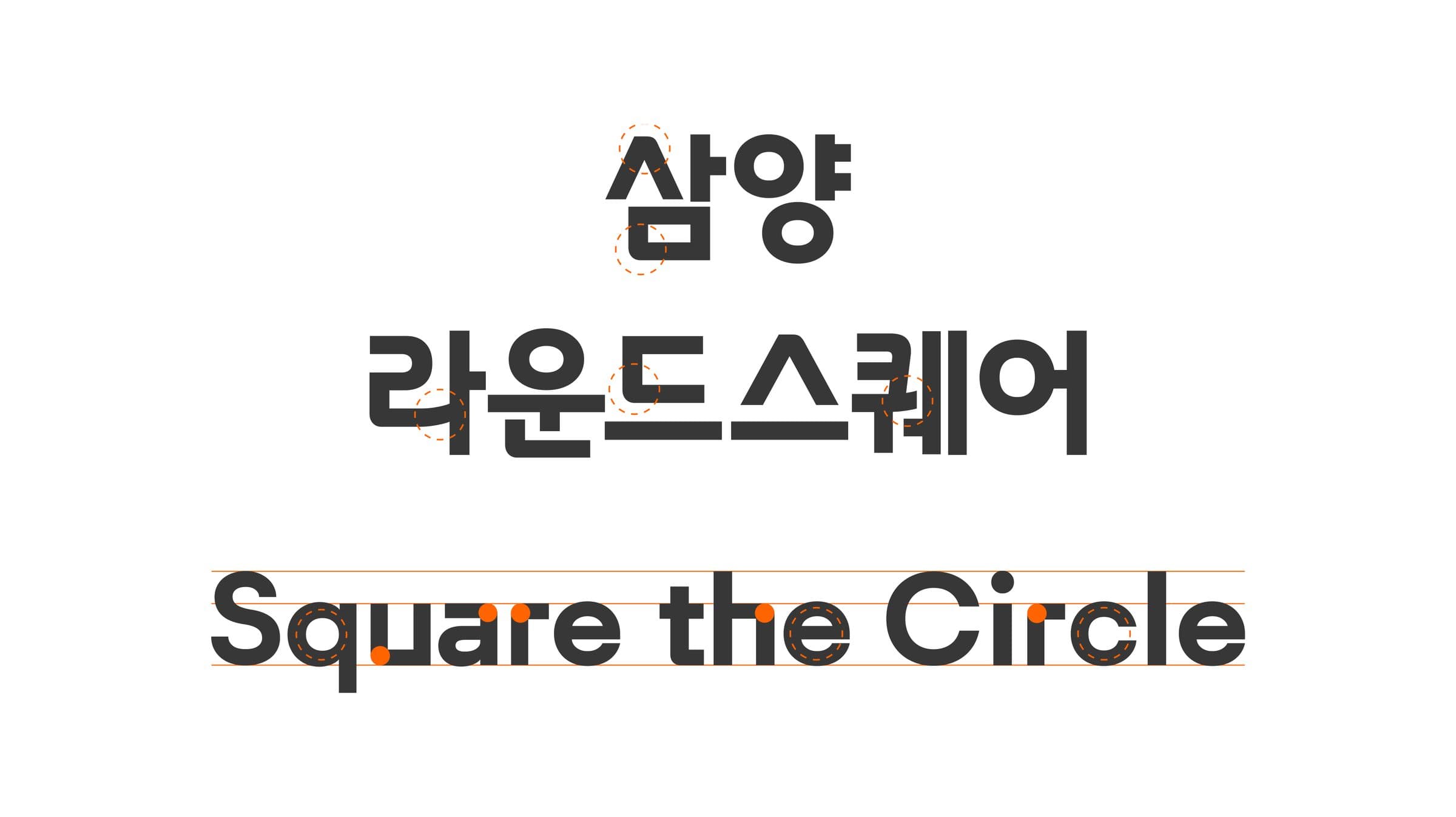
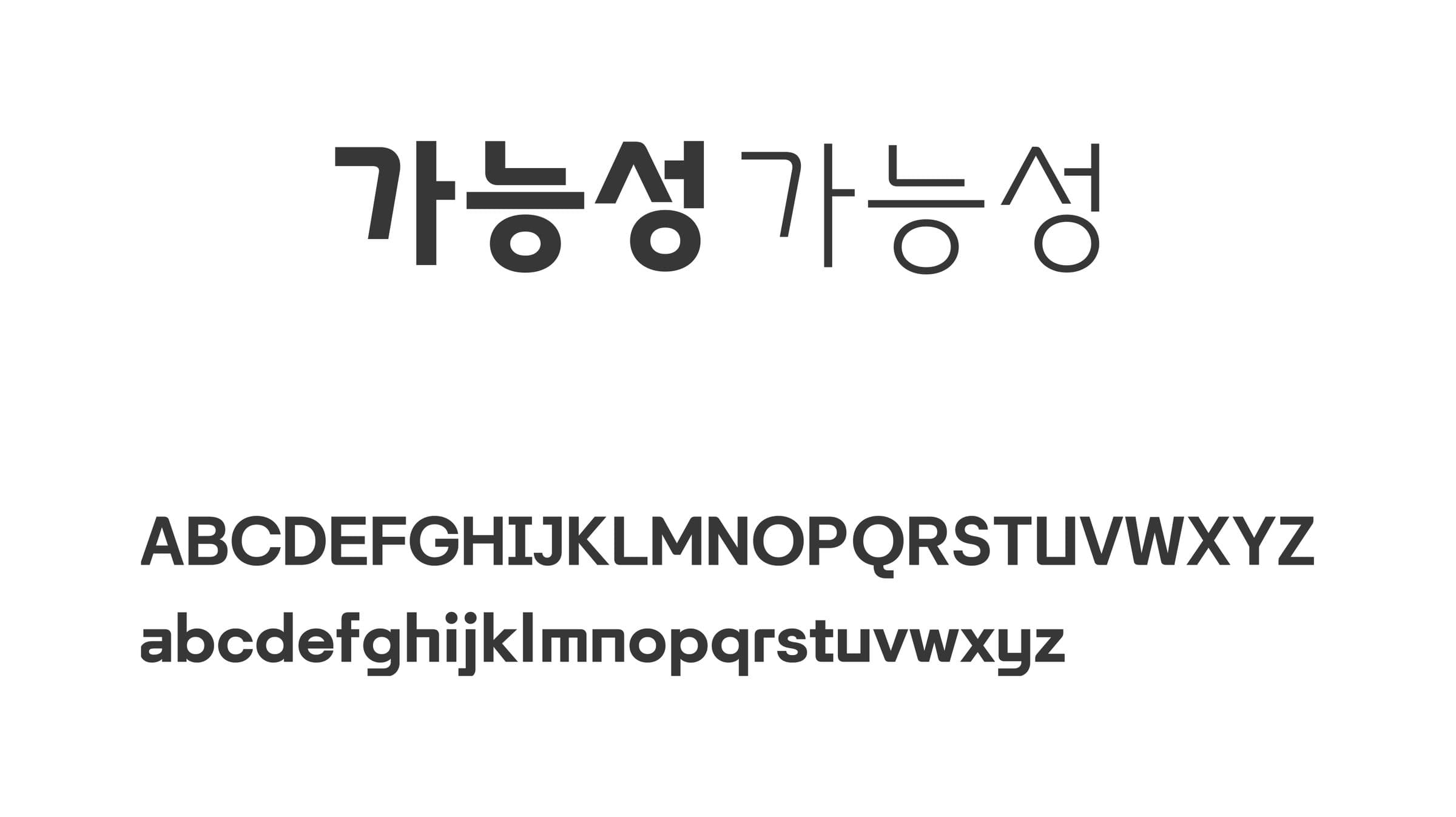
Roundsquare Sans is a principal asset, drawn from the geometry of round and square to strengthen the group’s brand identity. Balancing consonant against vowel, each stroke combines the curve of the round with the angular form of the square — a typeface that holds the Roundsquare identity whole.
Signage & Interior
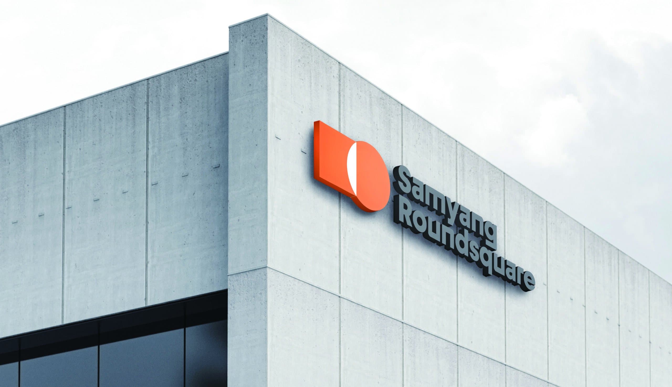
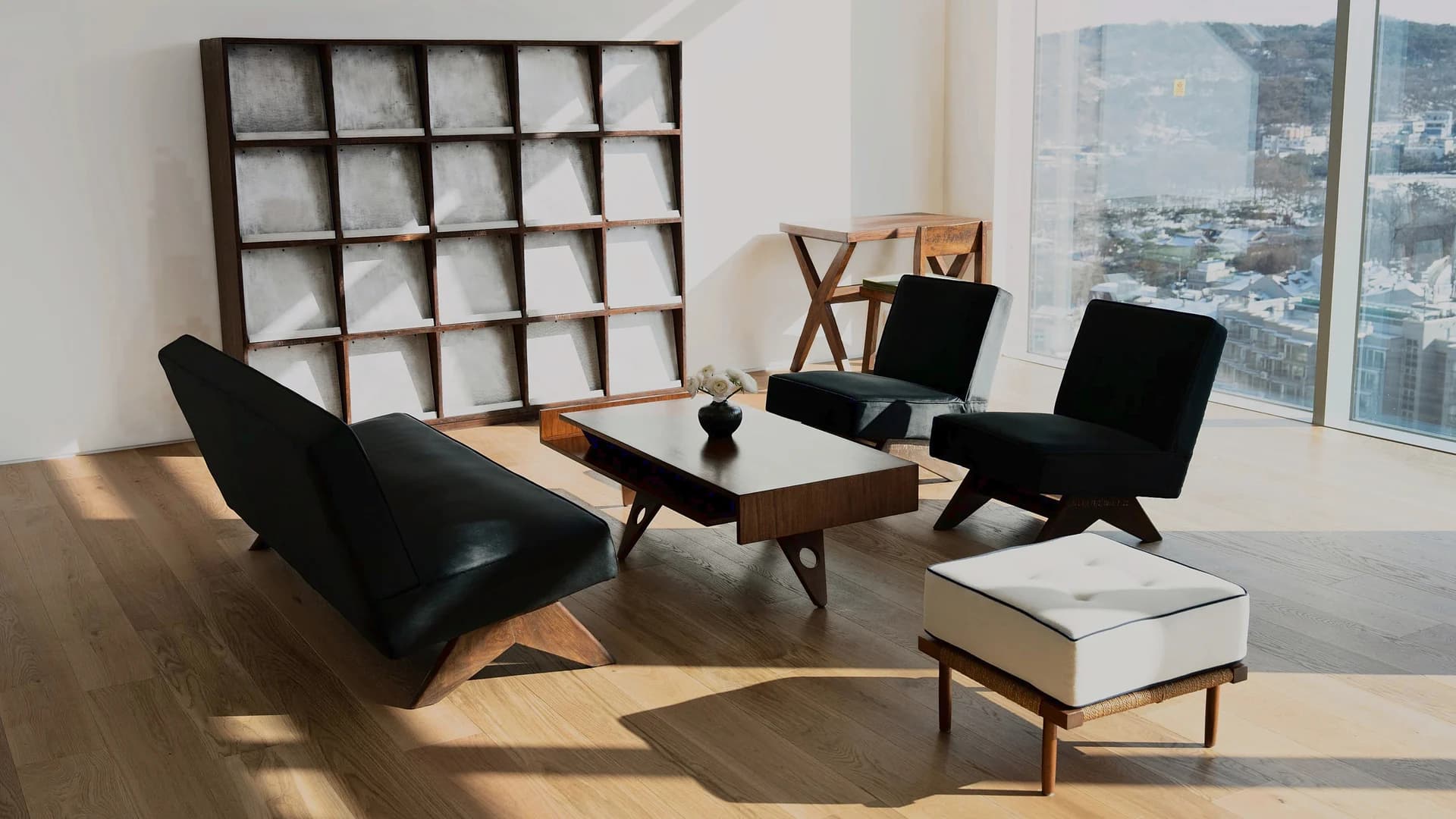
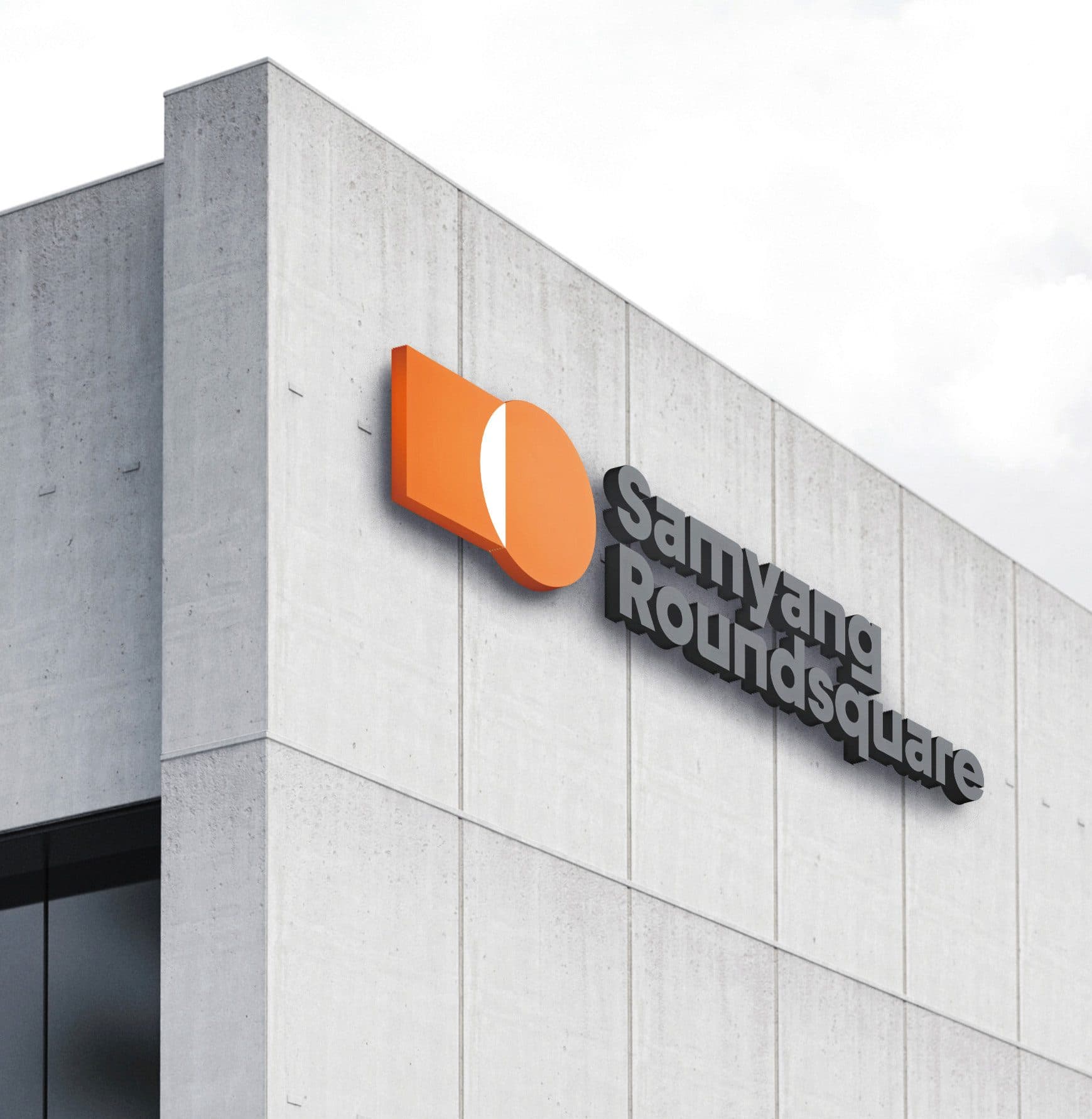
The symbol had to sit naturally in the building and still catch the eye. Graphic elements run through the entrances, set alongside lines carrying the company’s heritage, so that the group’s beginning, present and future are all present at once.
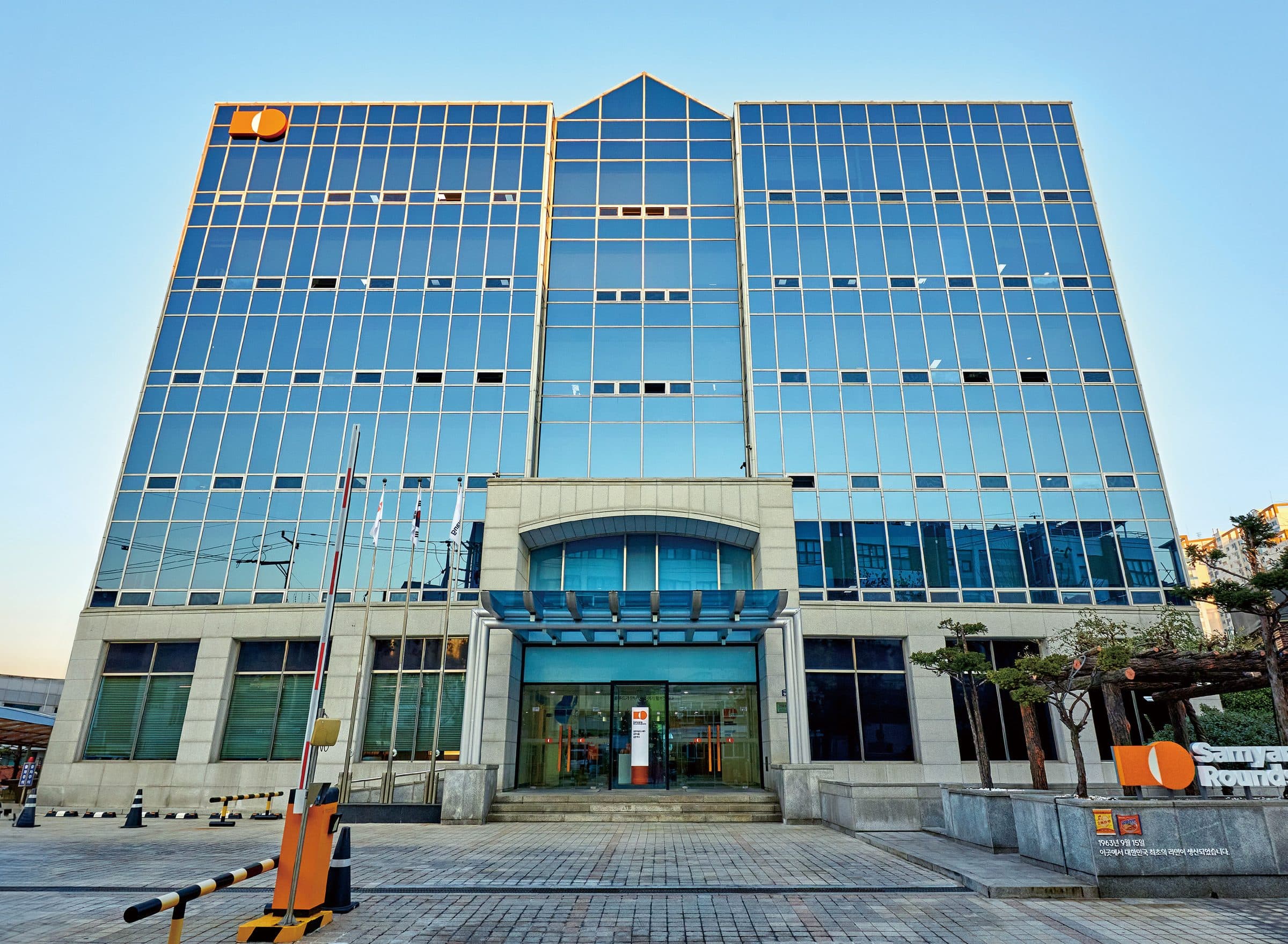
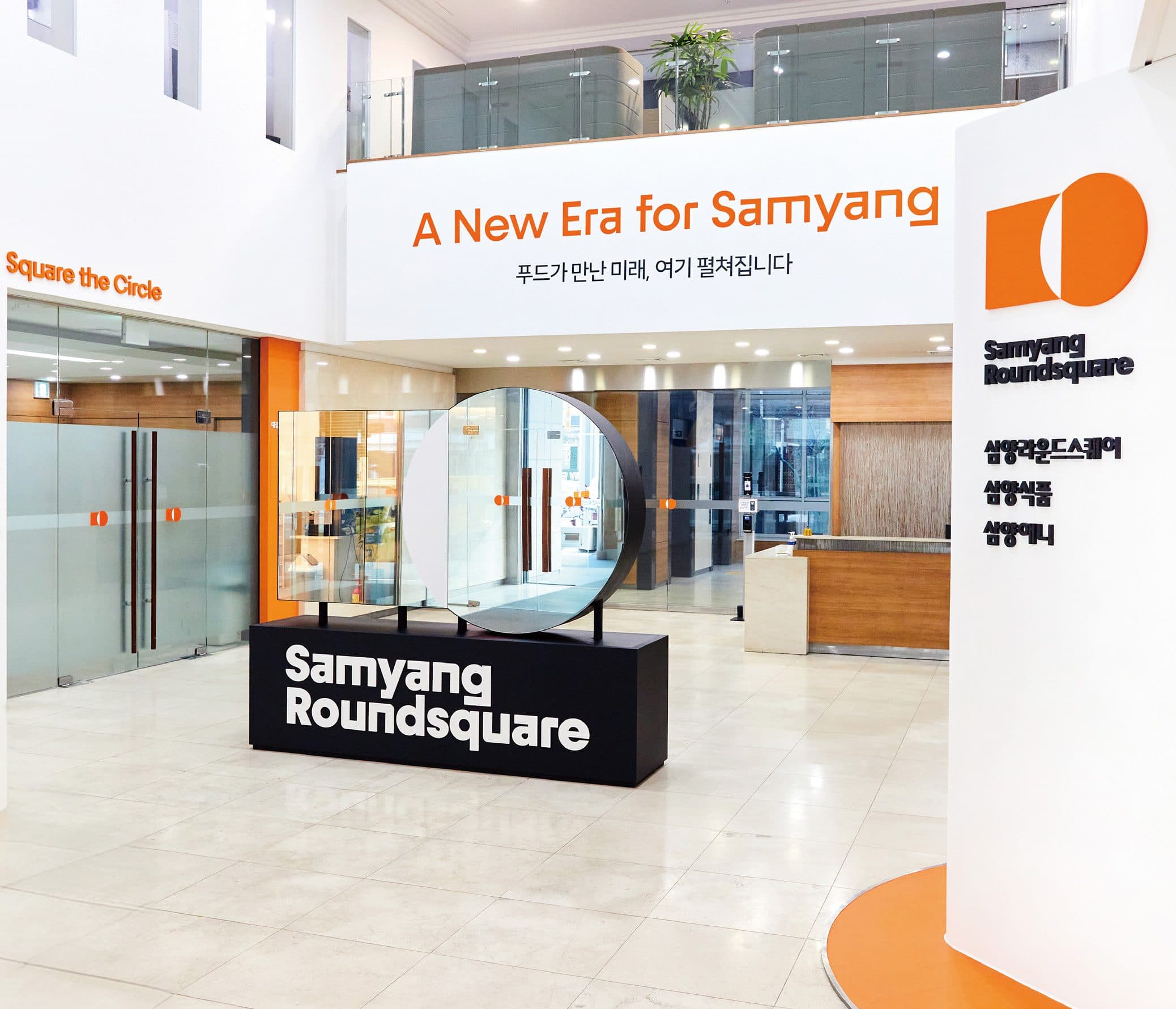
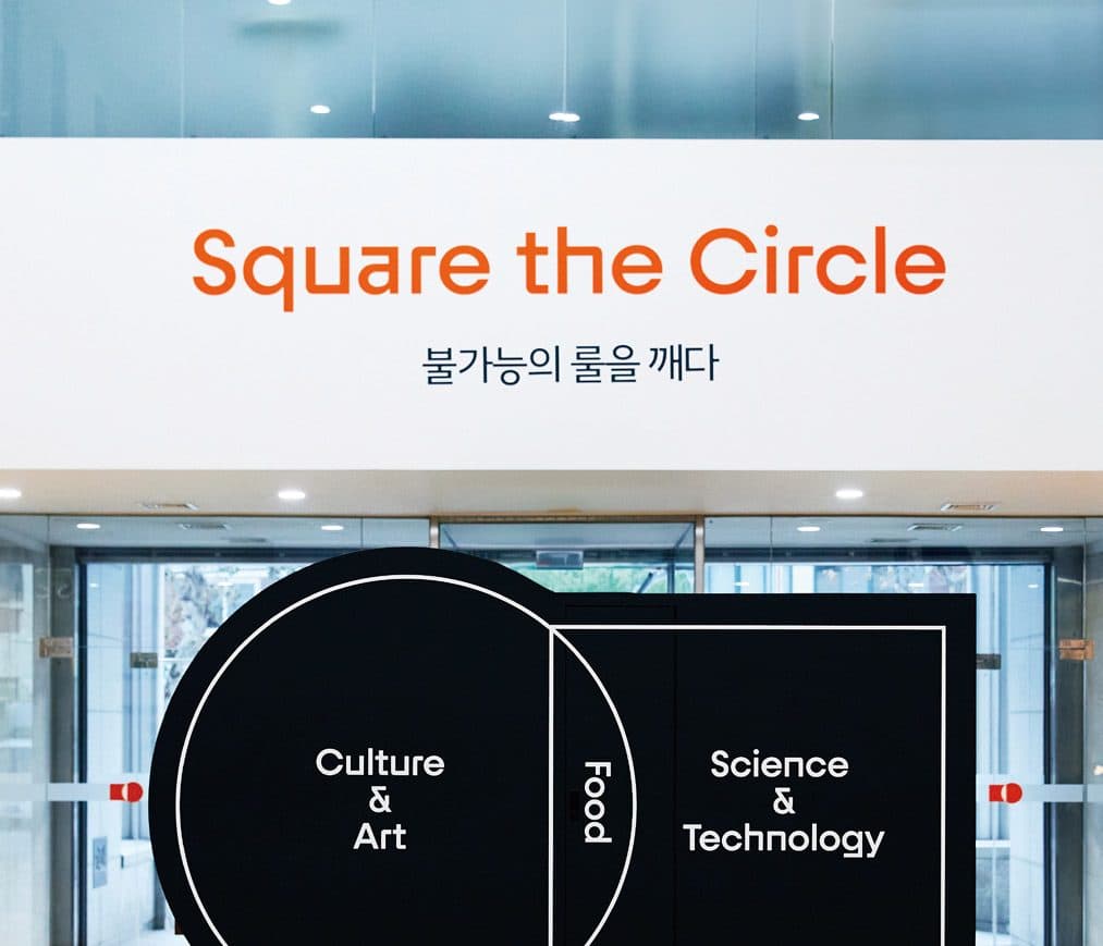
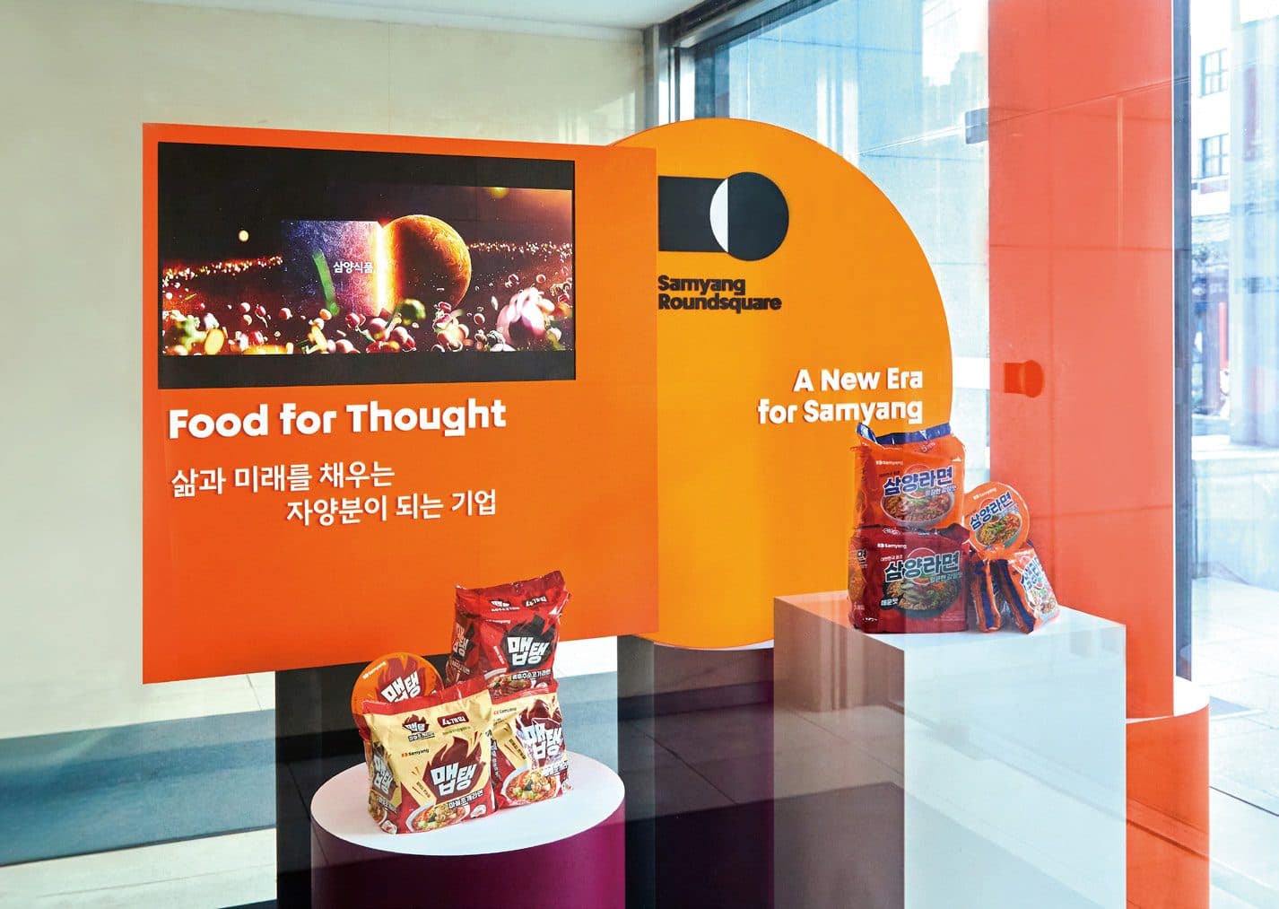
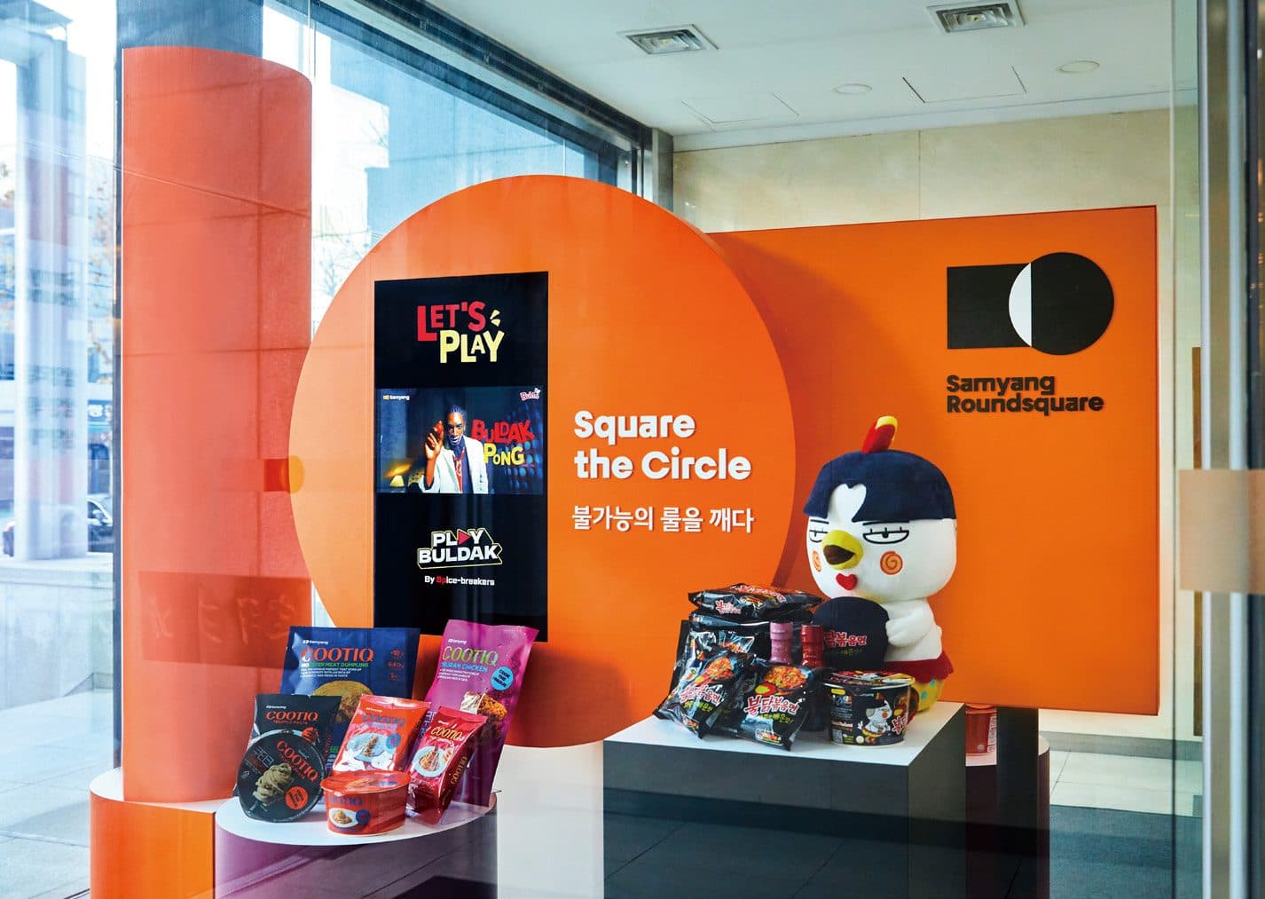
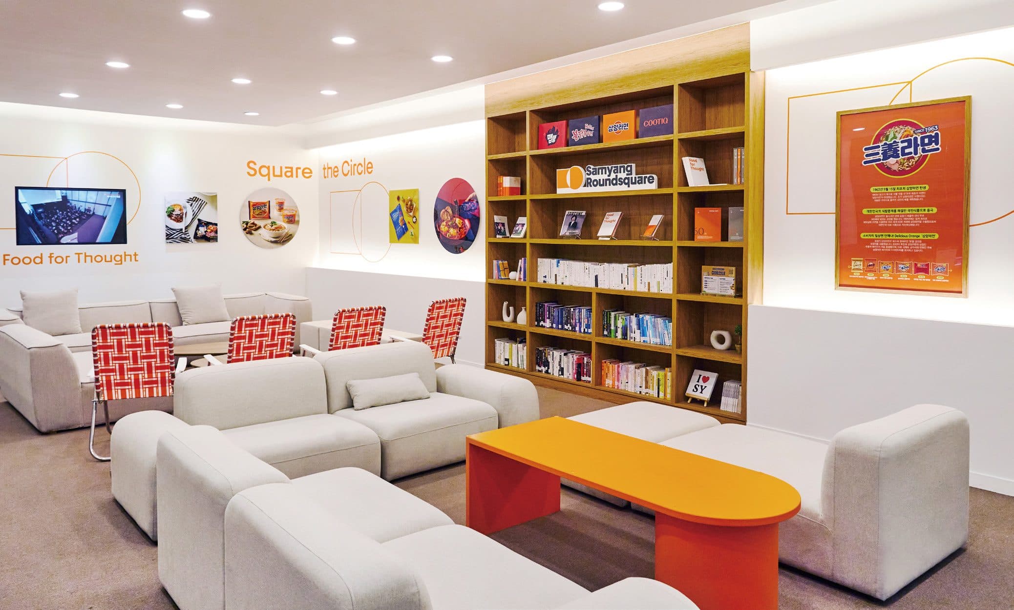
Round, Square, White Space and the newly established slogan were placed to be taken in at a single glance. The core of the brand identity then carries through the interiors, giving each space its own reading of the brand.
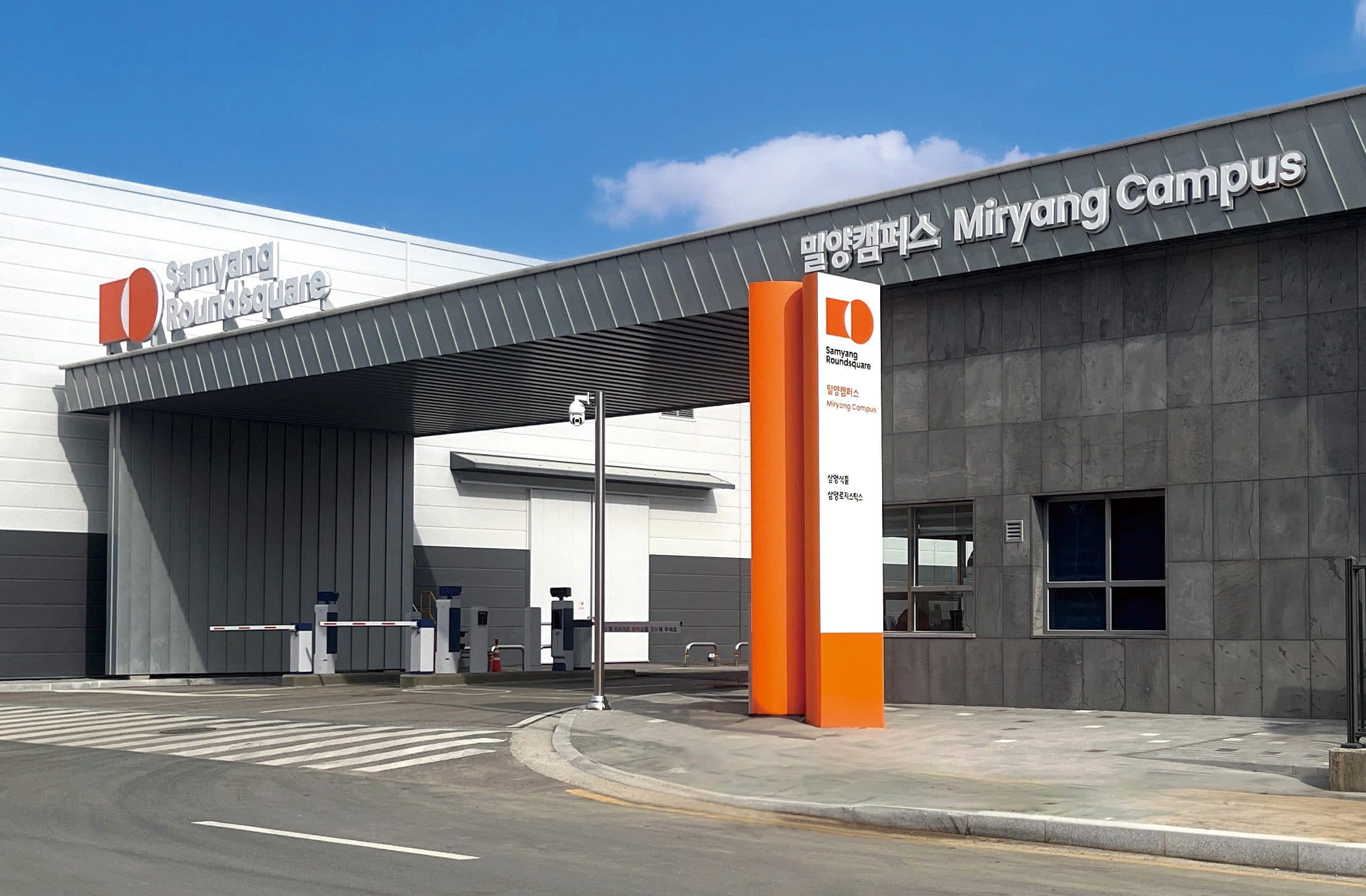
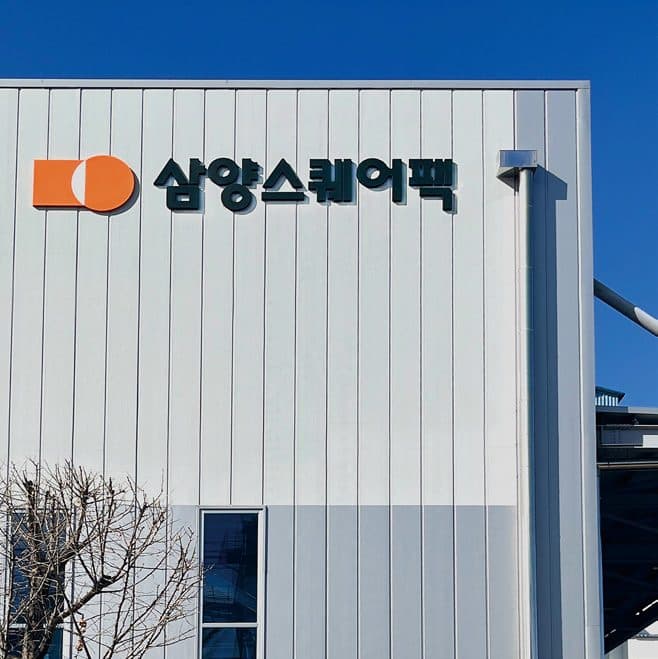
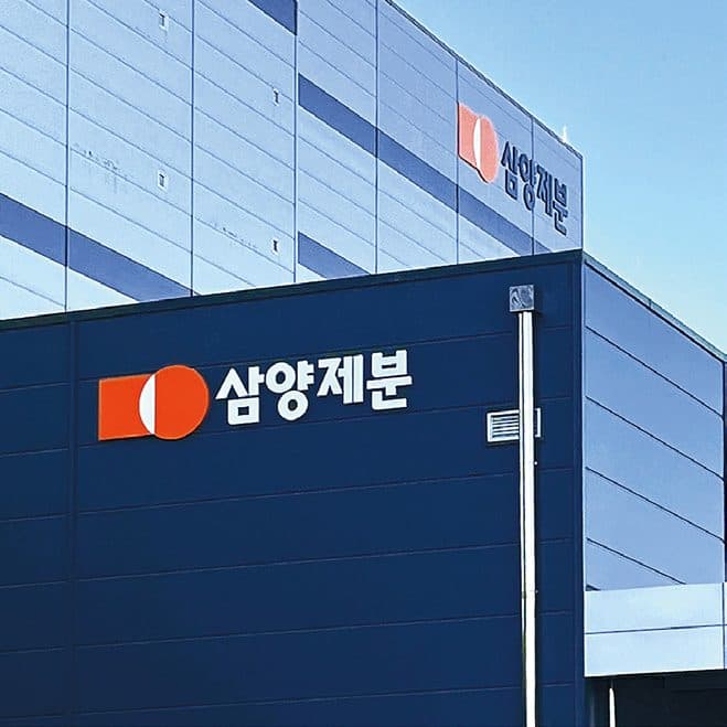
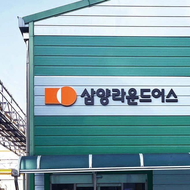
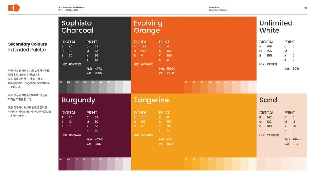
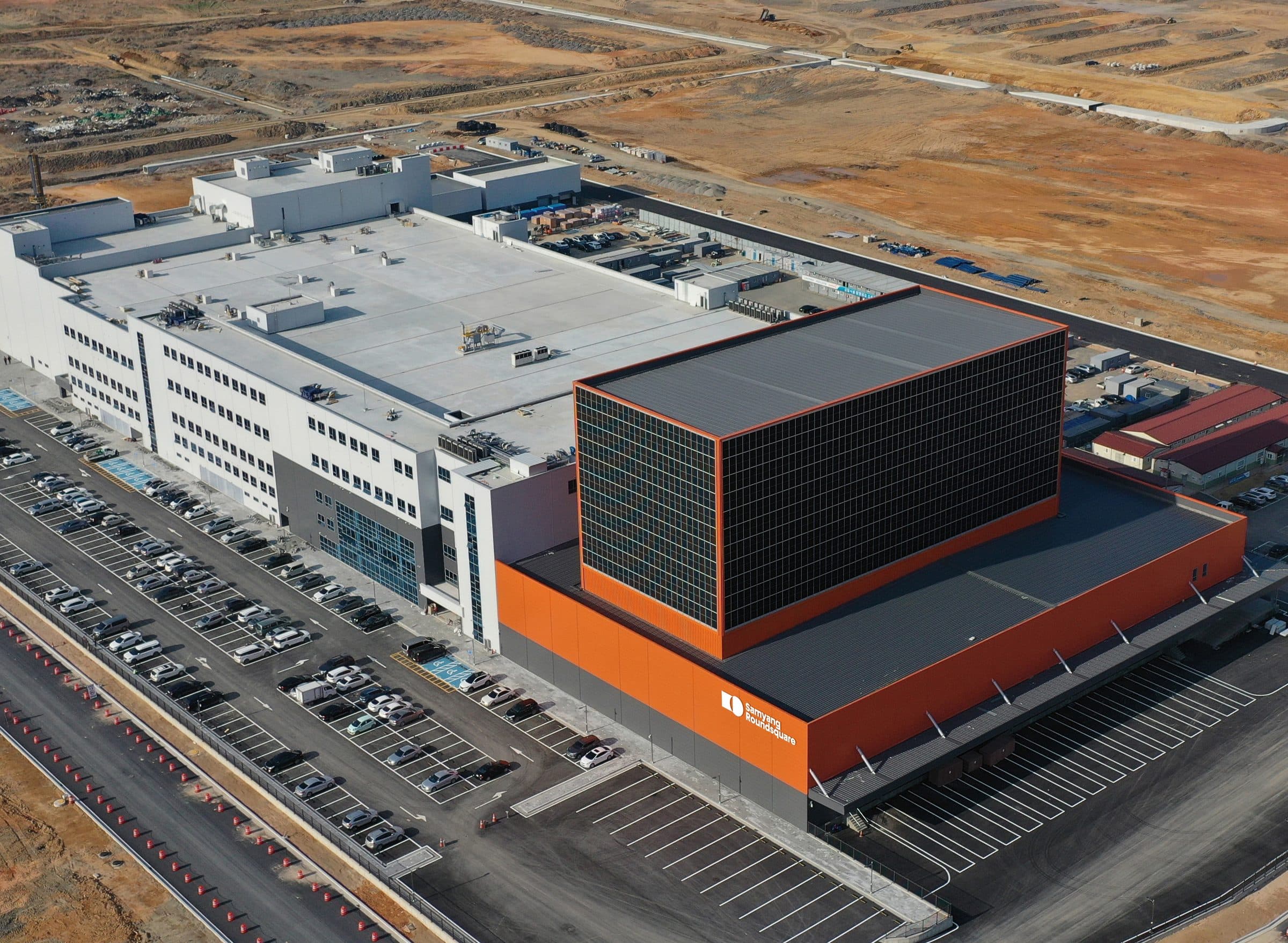
The Wonju plant was renamed Wonju Campus, and signage went up across the production campuses to raise the visibility of the new CI and name. Evolving Orange was tuned to each background for legibility. Several affiliates share these sites, so the work had to state each business clearly without losing the unity between them.
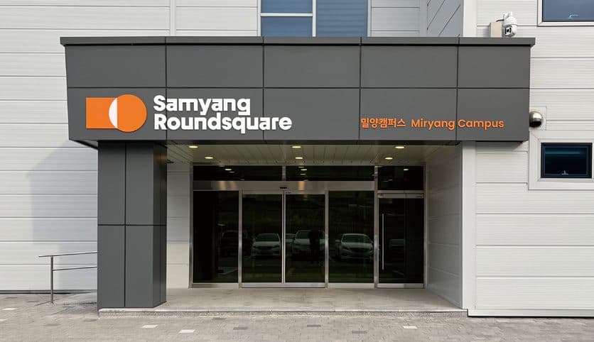
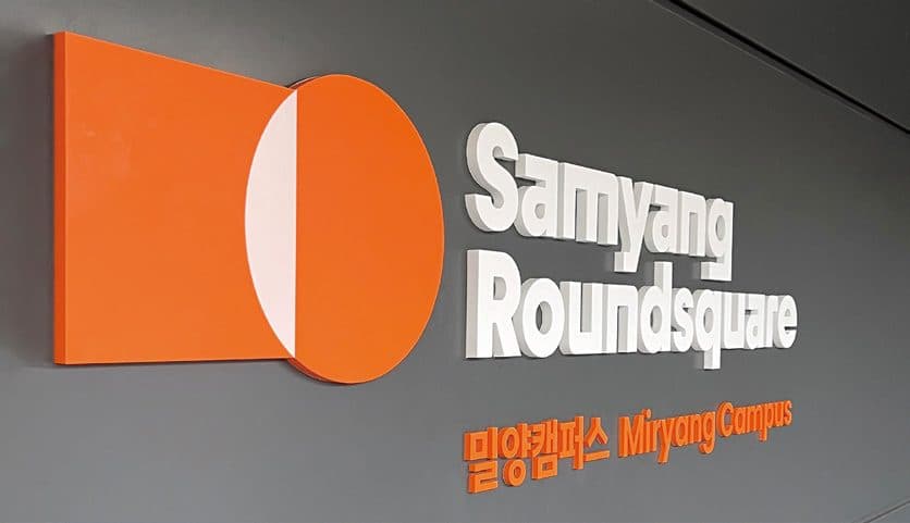
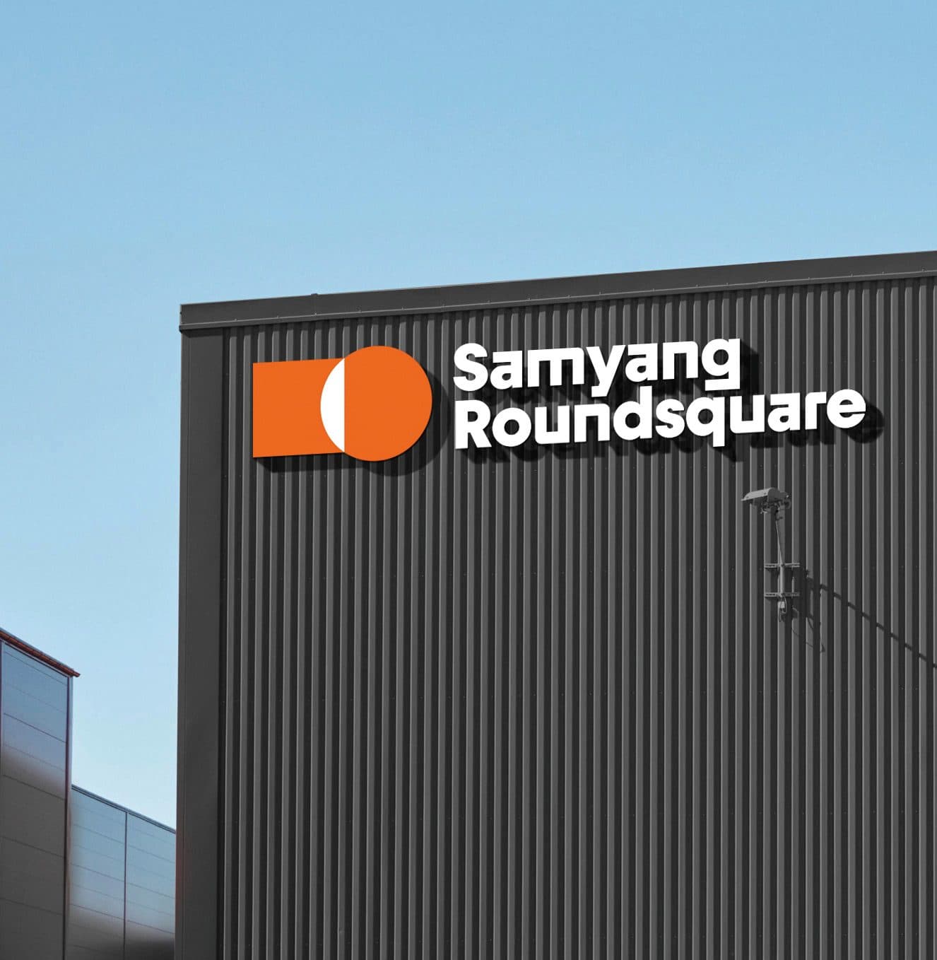
Opened in May 2022, the Miryang Campus states the group’s identity from the entrance. A white wordmark and orange symbol sit on the dark facade for prominence, and the campus name is set in Korean and English side by side so it reads from any approach. The signage is built from the same visual elements established at Wonju.
Application
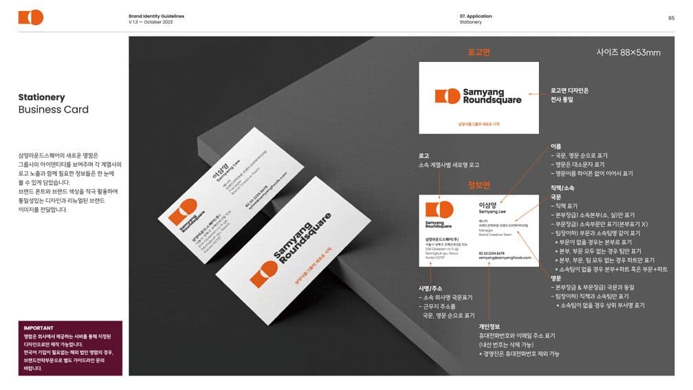
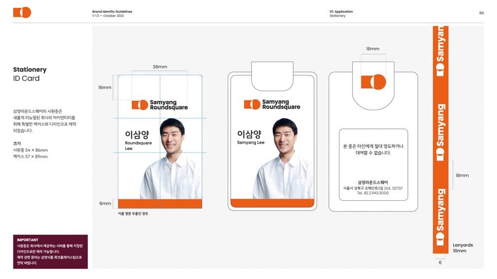
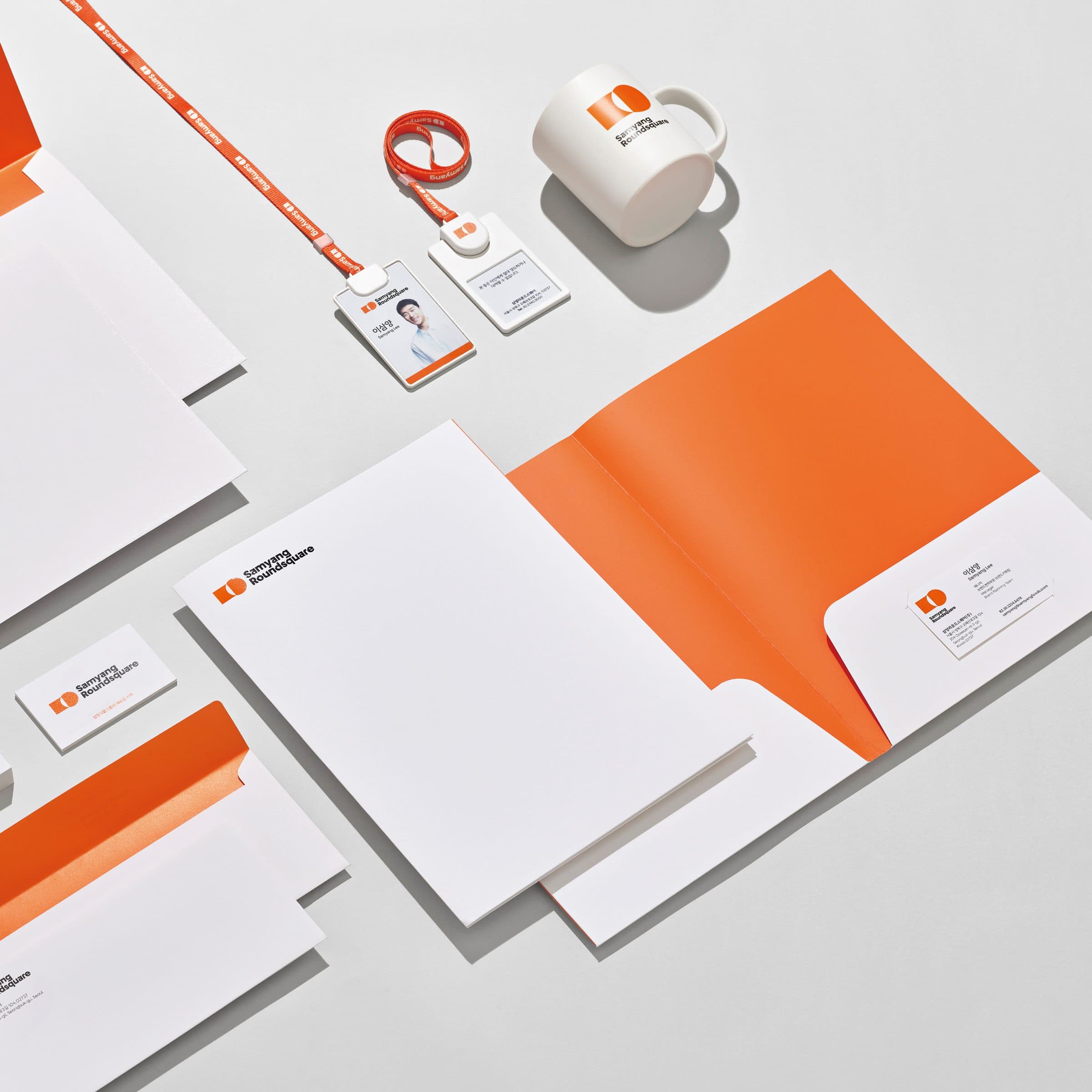
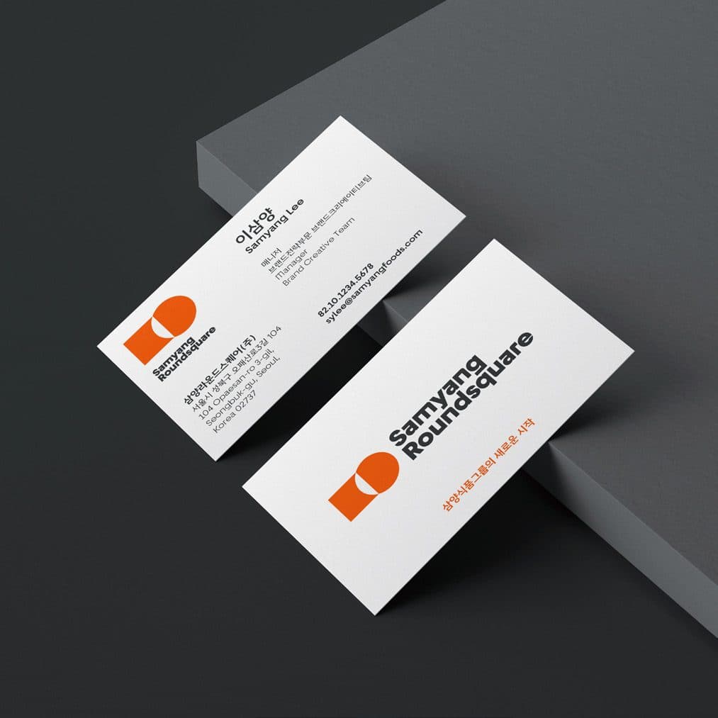
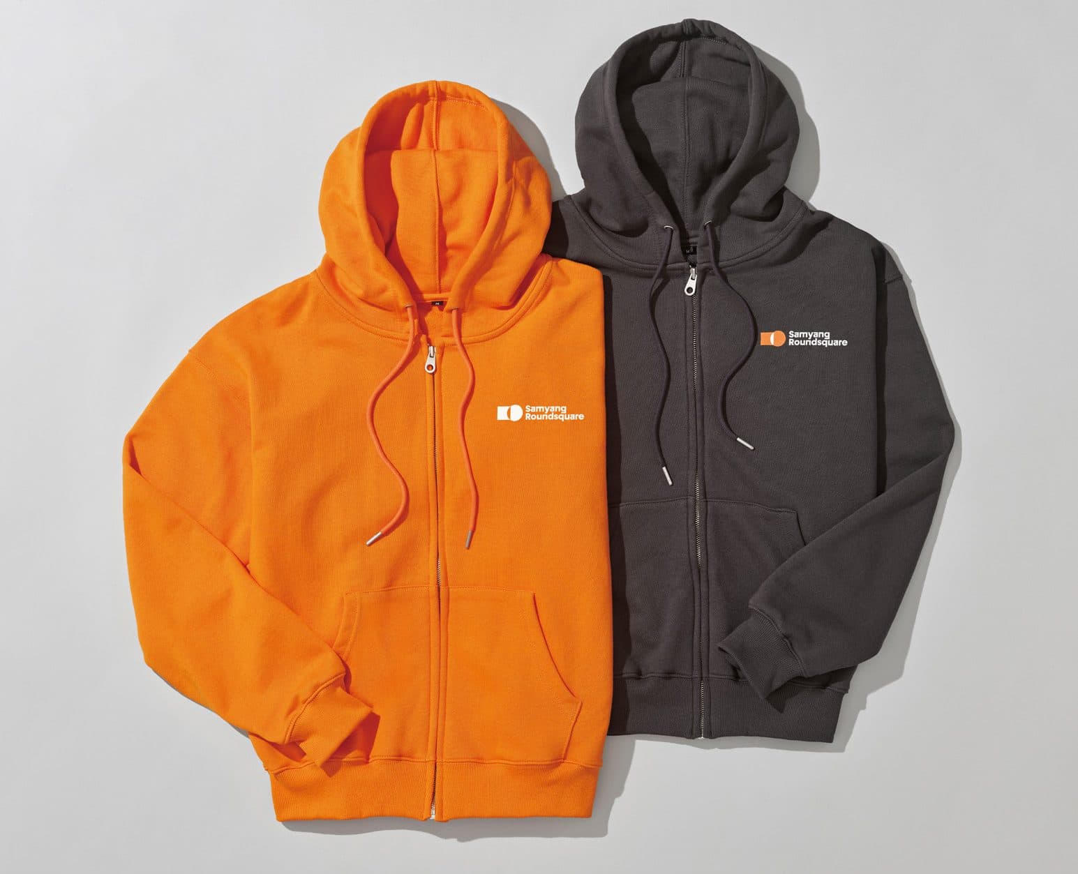
The new CI was put to work across the everyday objects of the office. Photo IDs, business cards, mugs — the items reached for most often — were stripped of excess but kept in balance. Placing the signature colour with care gave the set a clean modernity.
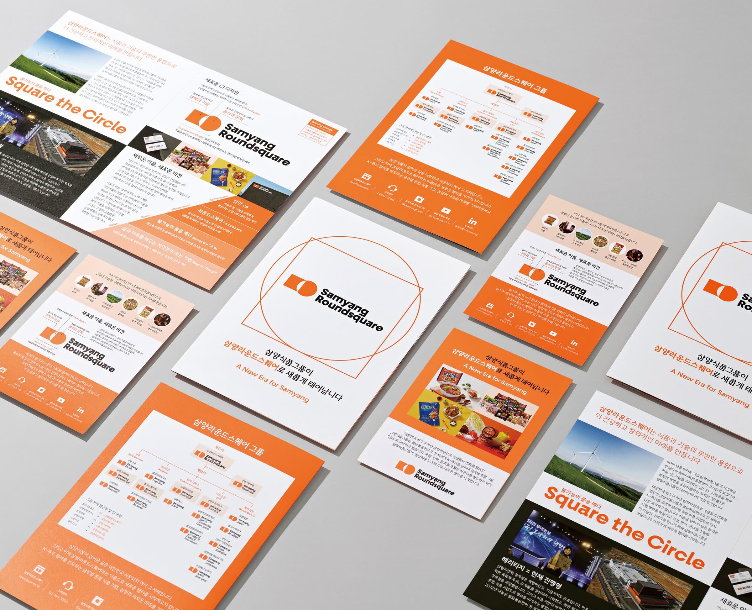
A brochure for affiliates and partners, and a leaflet for consumers, both carrying the vision of Samyang Roundsquare as the group’s new beginning. Each explains the renewed name and logo and introduces the vision behind the slogan “Square the Circle.”
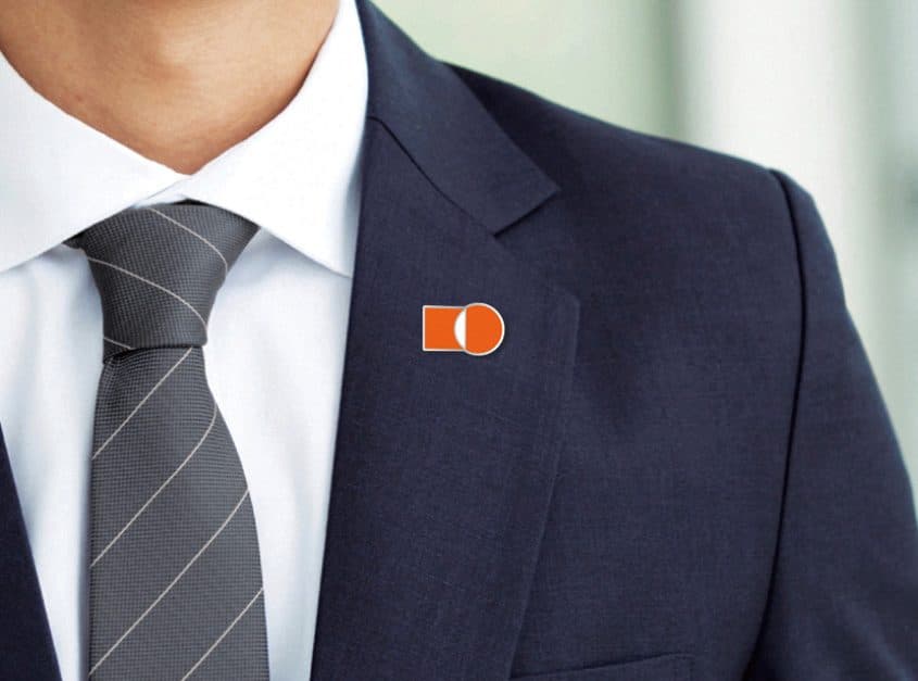
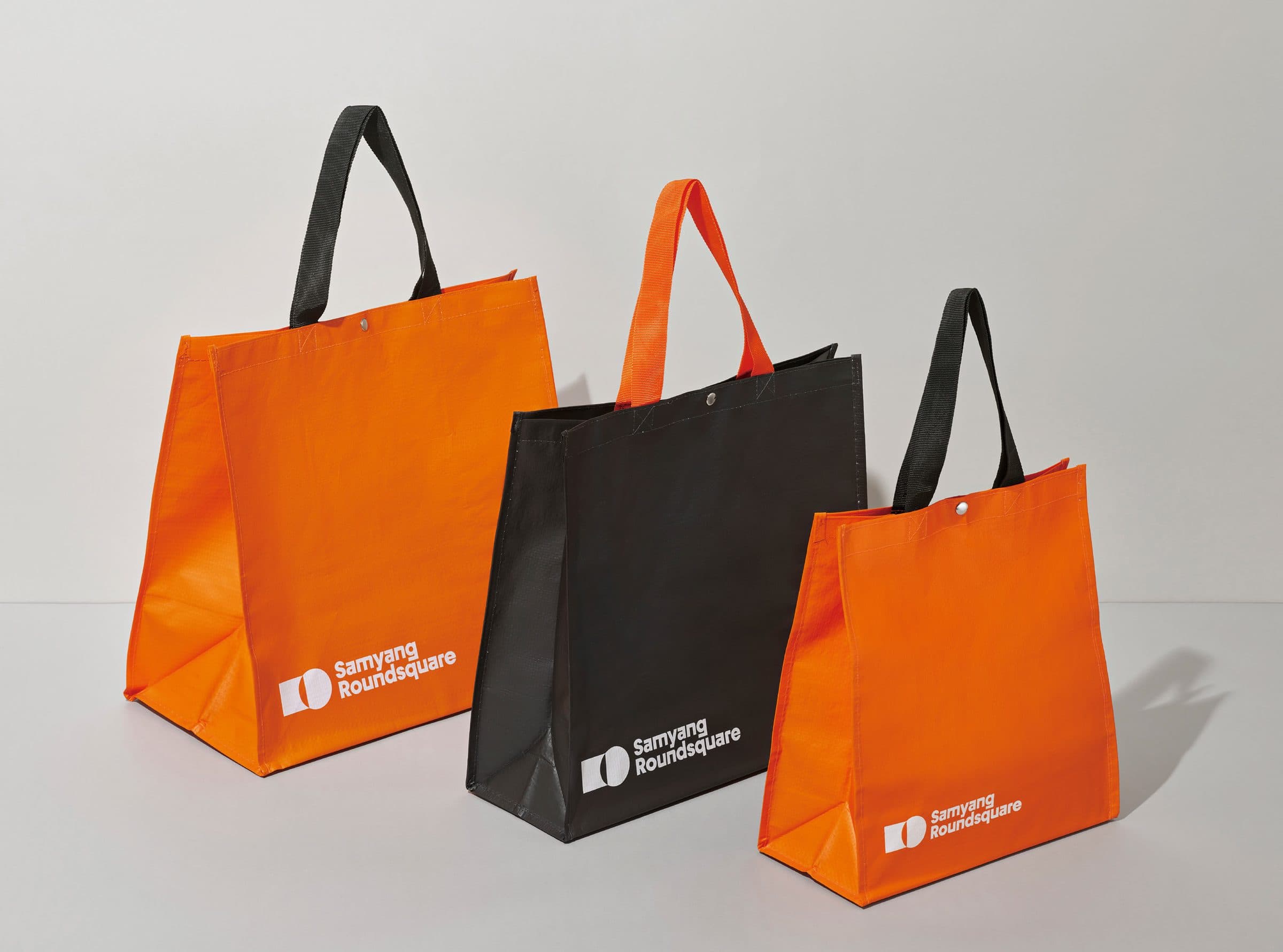
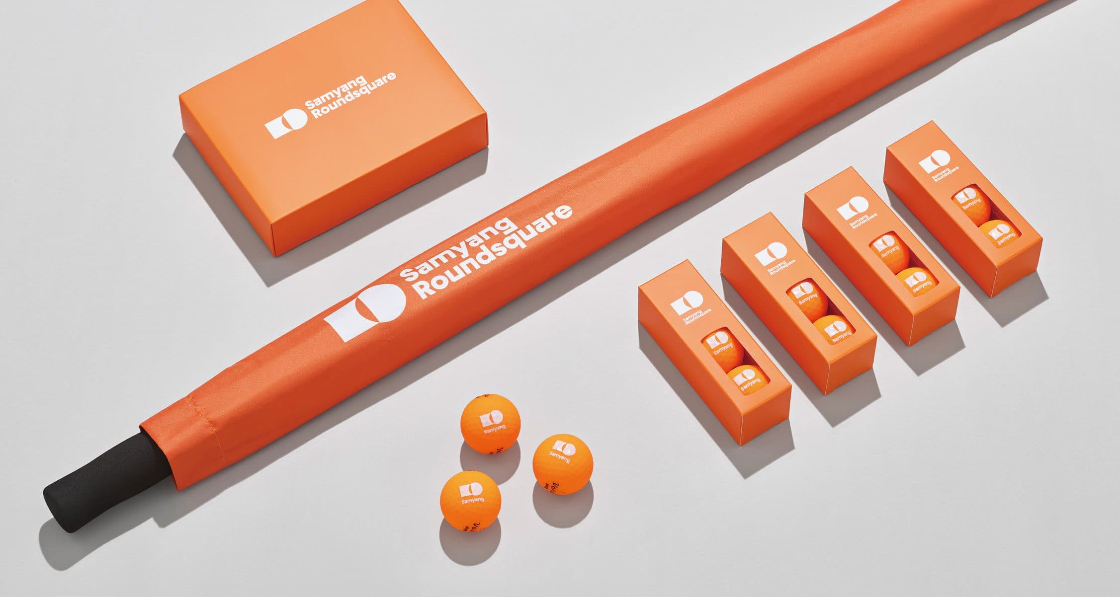
The badge carrying the symbol is an object of representation, drawn to be immediate and unambiguous so that anyone wearing it at a formal occasion or on external business carries the posture of standing for the company. Shopper bags, golf kit, wraps for the sales and logistics fleet — the same principle runs through every point where the brand is met outside the office, so it reads as one identity wherever it appears.
Packaging Rollout
Internalization
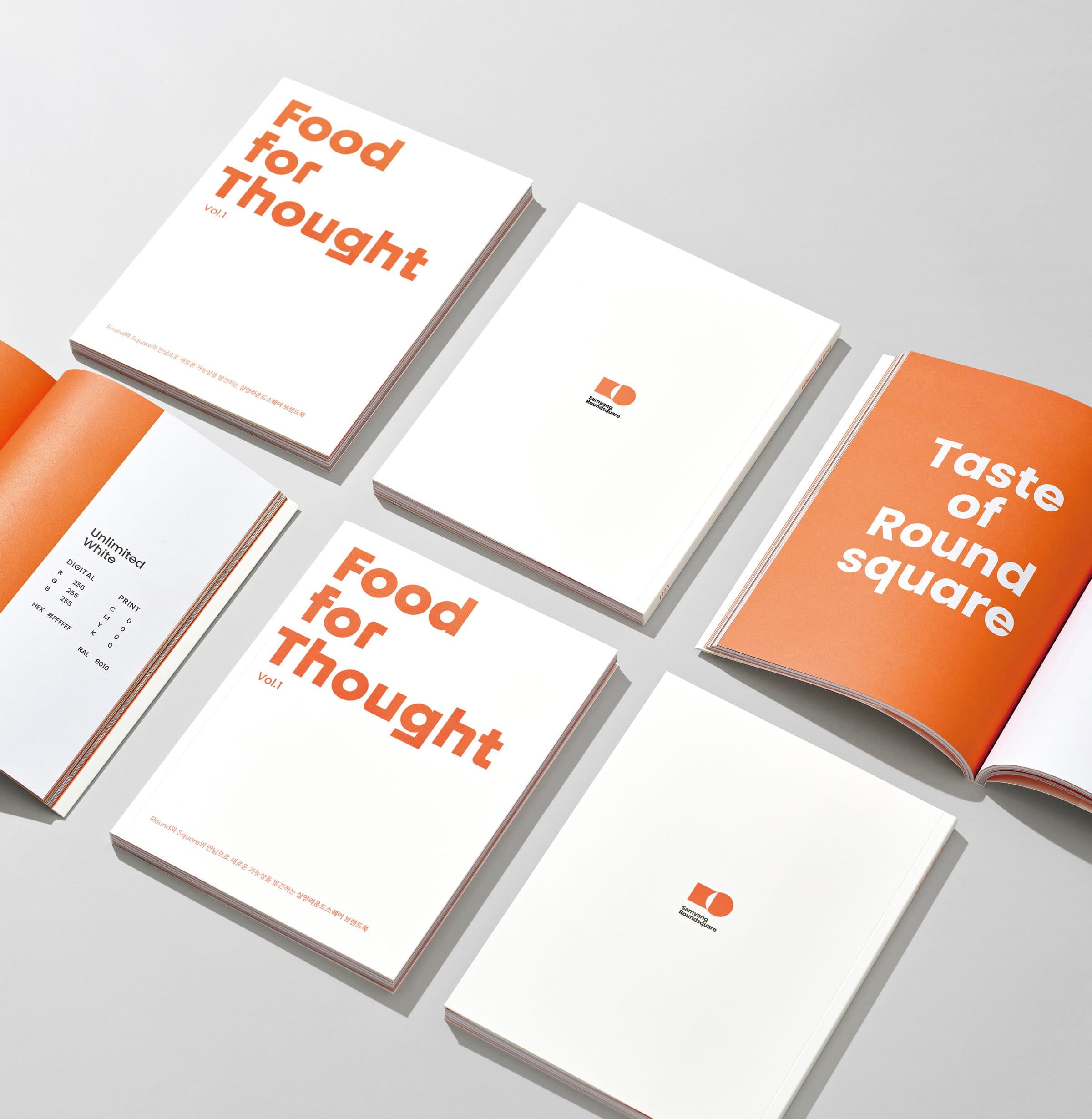
Brand Book
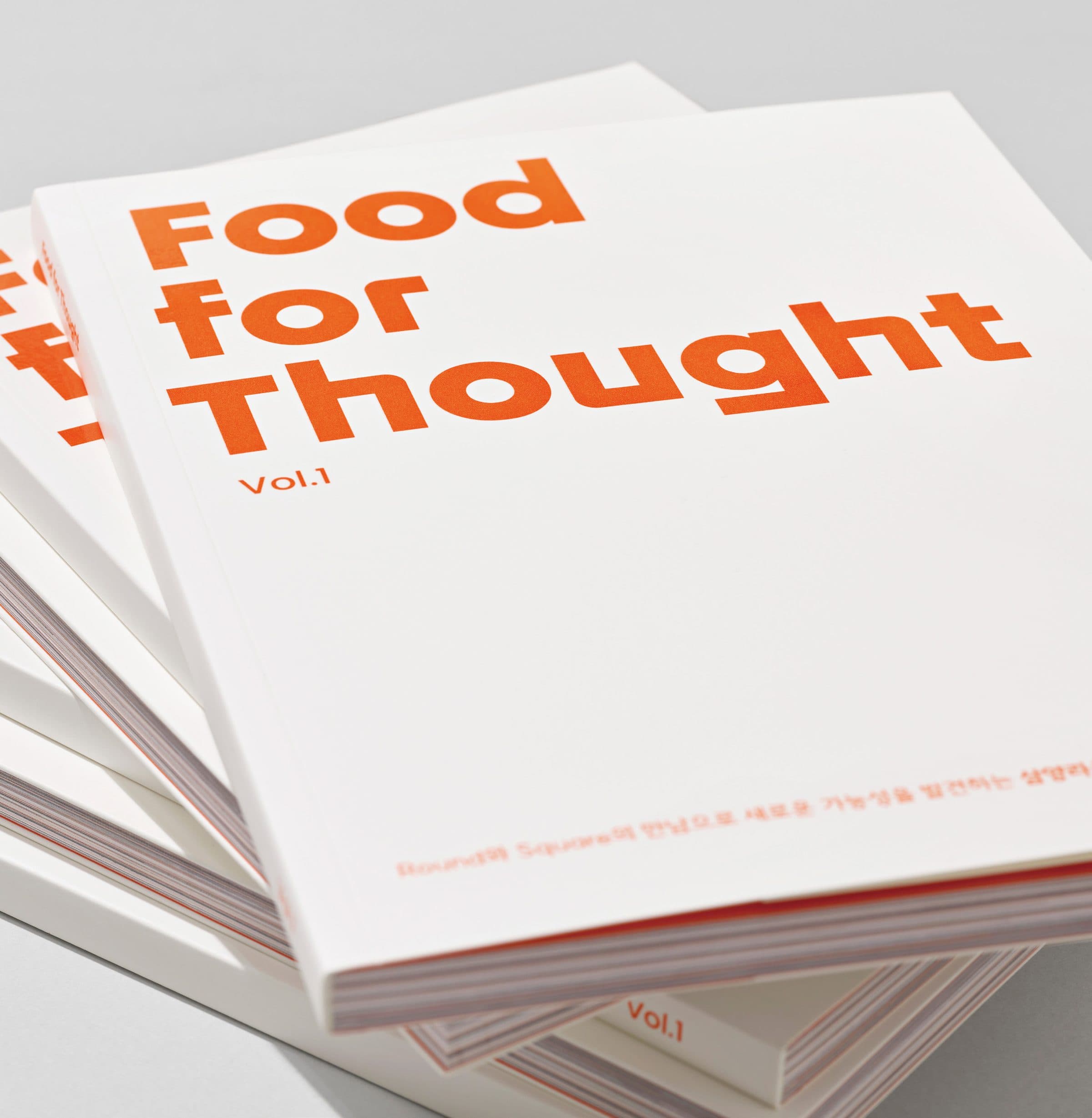
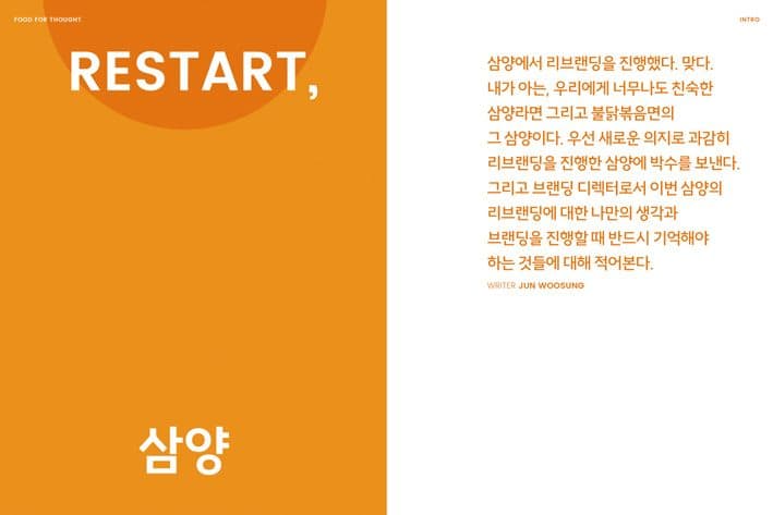
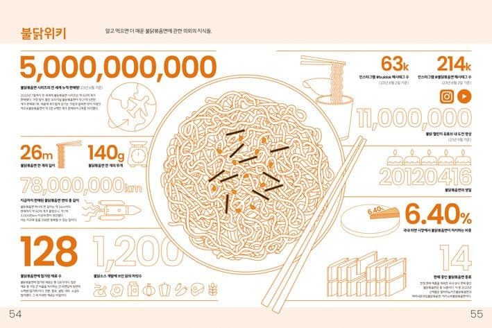
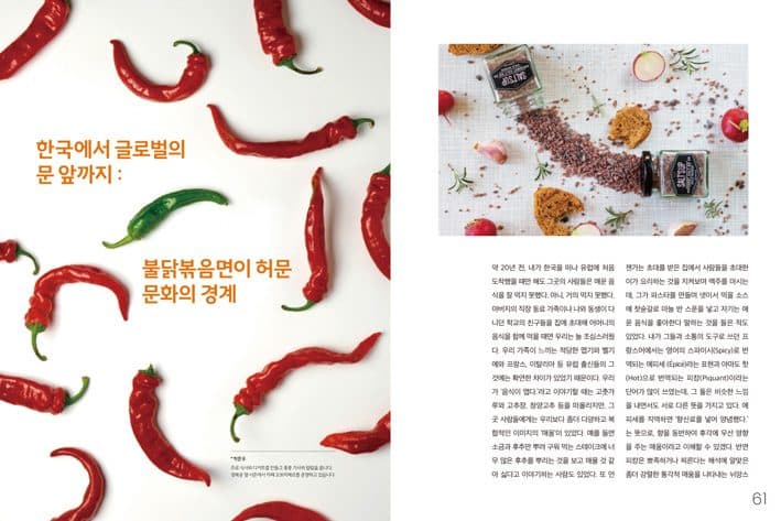
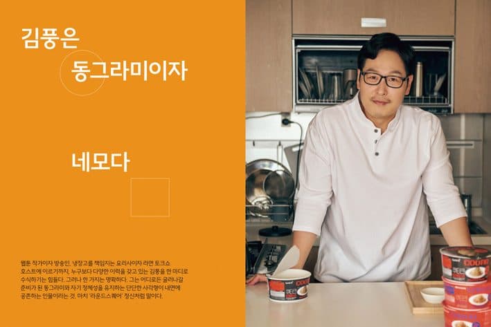
The brand book was published to carry Roundsquare thinking outward and invite agreement with its values. It sets out the group’s history and future, its values, its reach and the direction ahead, and keeps a light touch throughout — from the raw ingredients that taste begins with to interviews with the people who think and work the Roundsquare way.
Internal Sharing
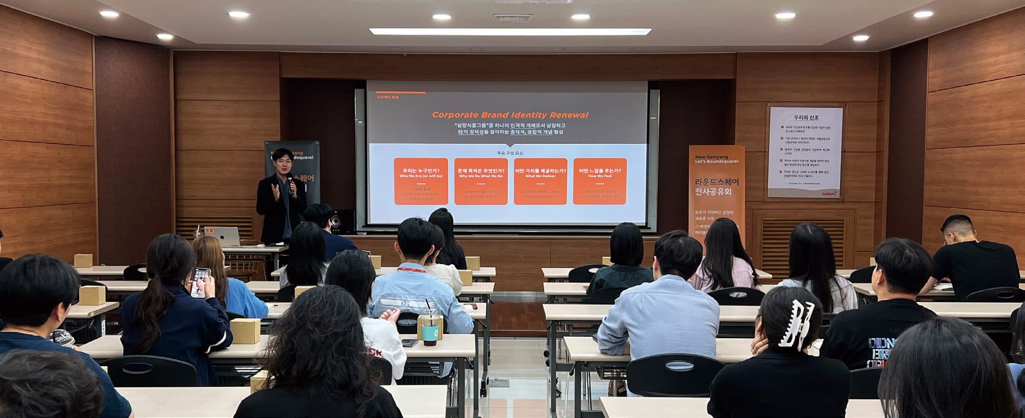
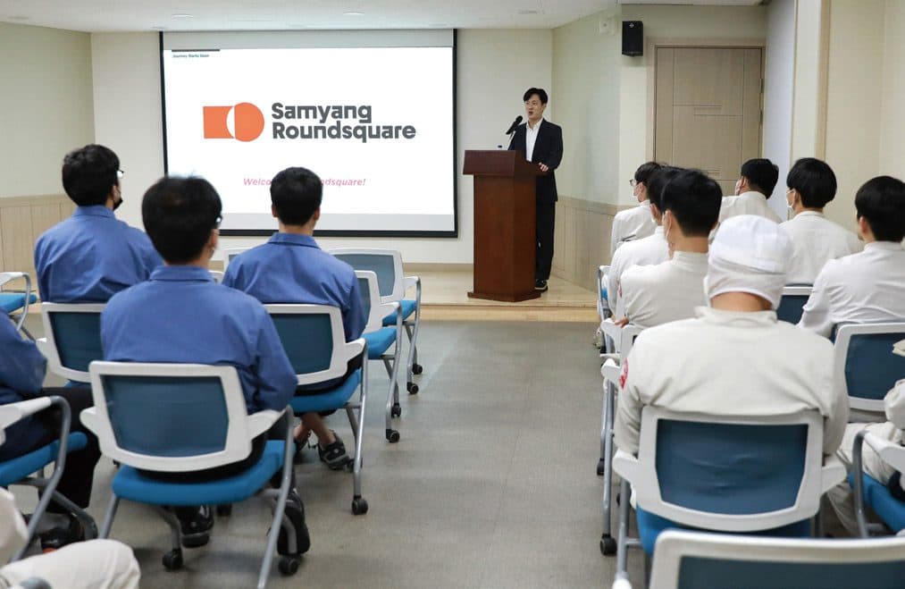
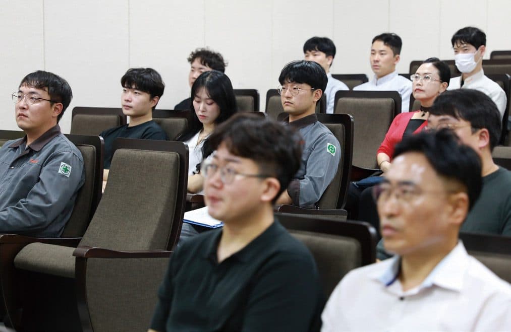
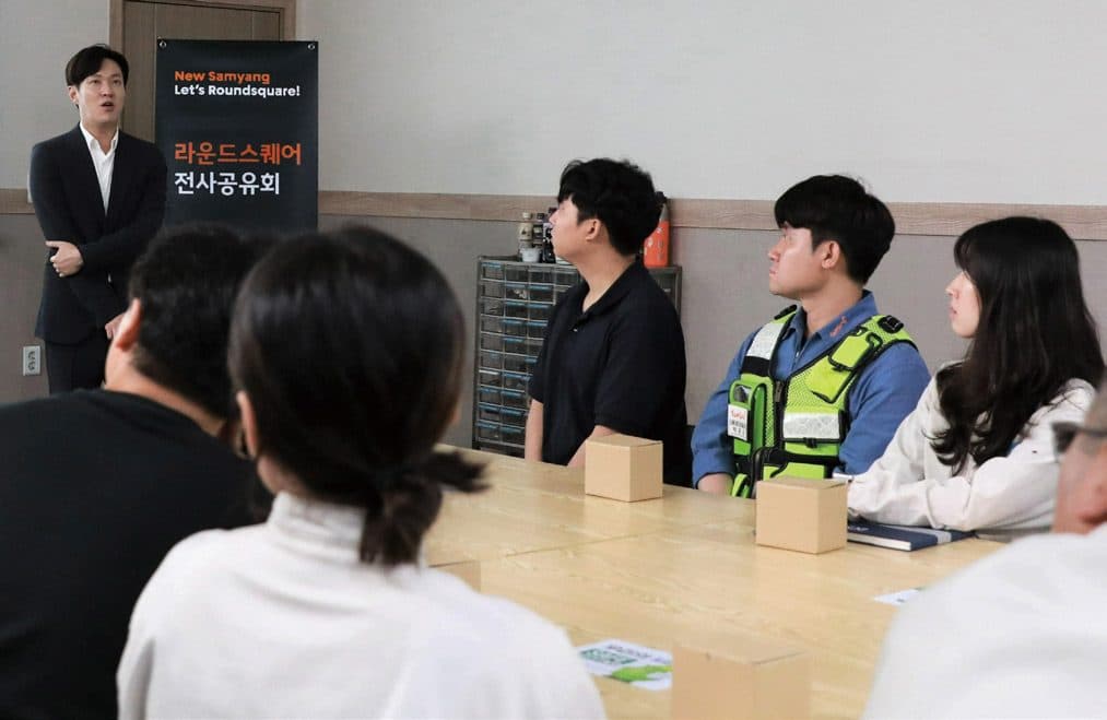
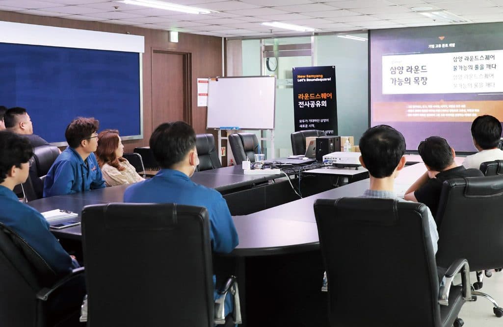
The people who would carry the change are the employees. Before the CI renewal went public, it mattered to explain its meaning and direction to them first and to build agreement through that process. The new CI, vision and slogan were therefore shown to employees region by region, ahead of the announcement.
Secret Agent Kit
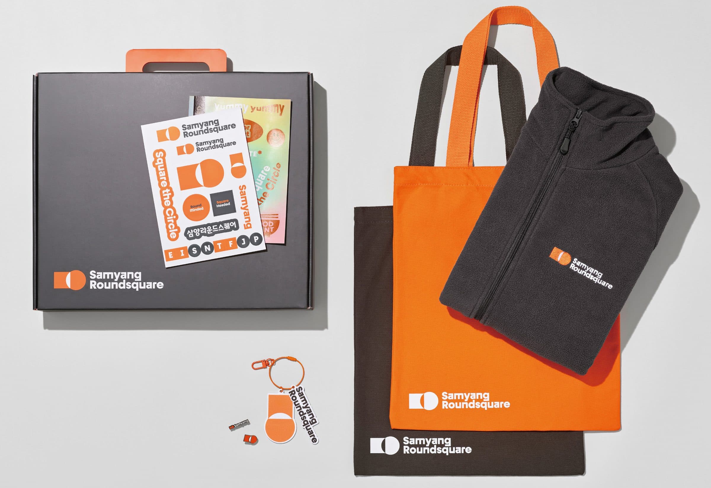
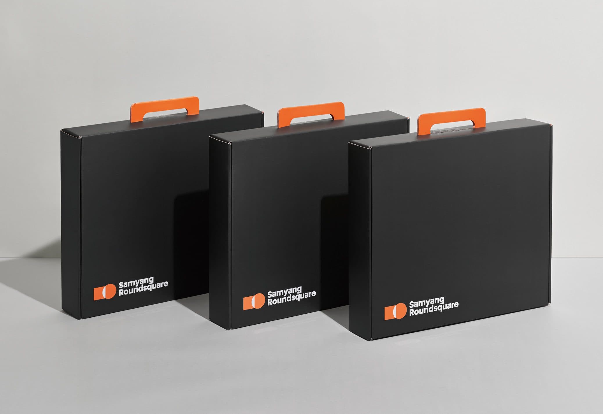
A gift box was conceived to give employees joining the group’s dynamic journey a brand experience worth having. Built on the concept of a “secret agent” — carrying the Roundsquare mindset and charged with spreading it — the box delivers the new name and vision to everyone.
Guideline
To establish the brand identity, a visual guideline was produced covering everything from the symbol’s colour to the rules of its use. Logo sizing, brand colour combinations and worked examples of the CI in application — an A to Z built to make the new logo understood and easy to apply in practice.