Samyang1963
Challenge
Samyang has one of the most important origin stories in Korean food: the launch of Korea’s first instant ramyeon in 1963.
But much of that history had remained exactly that — history. The challenge was not simply to recreate an old product, but to find something from Samyang’s past that could become meaningful again.
My role
I led the naming, brand strategy, packaging design direction and launch communication for Samyang1963.
The project brought together product, design, marketing, PR and consumer experience around one question: how could Samyang use its own heritage without becoming nostalgic?
Strategy
We treated heritage as material for something new.
The name Samyang1963 made the founding year itself a brand asset, while the product reinterpreted the original beef-tallow frying method for today.
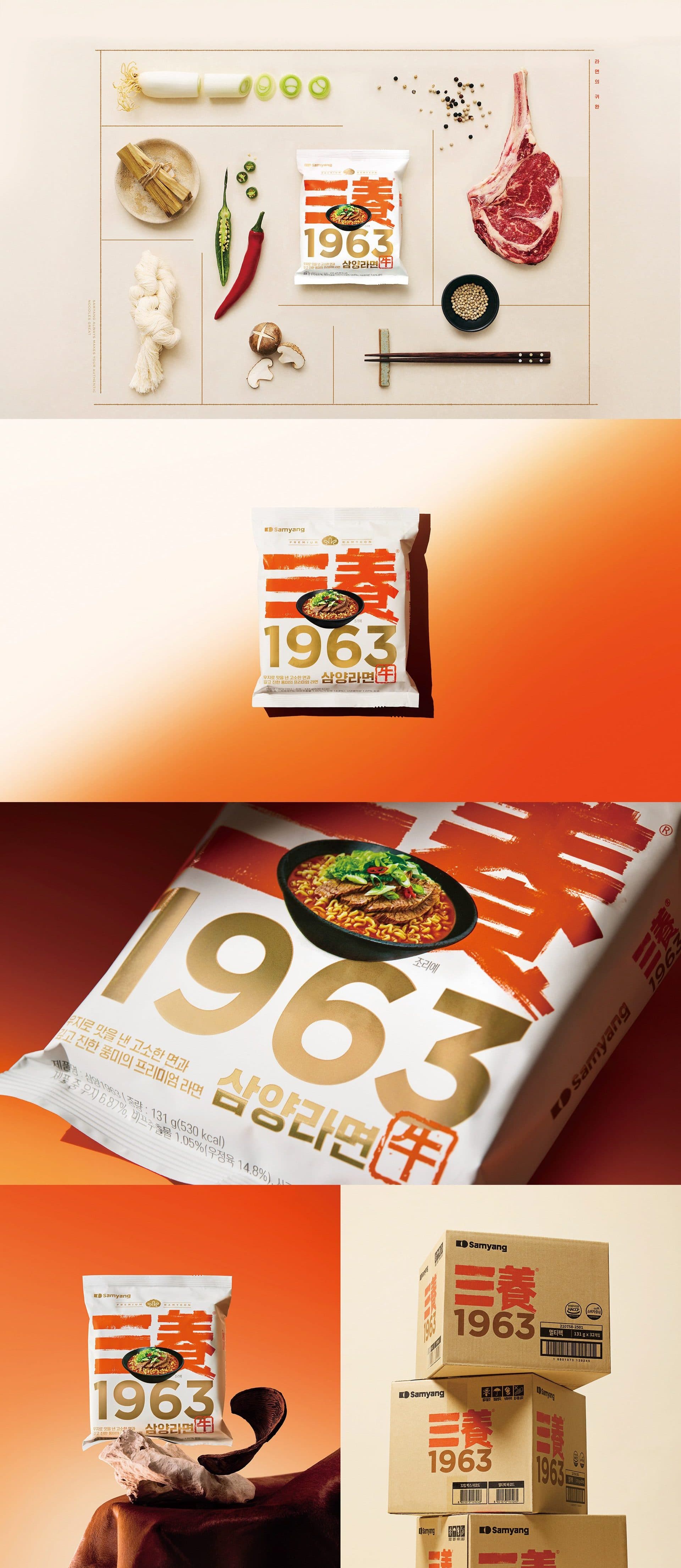
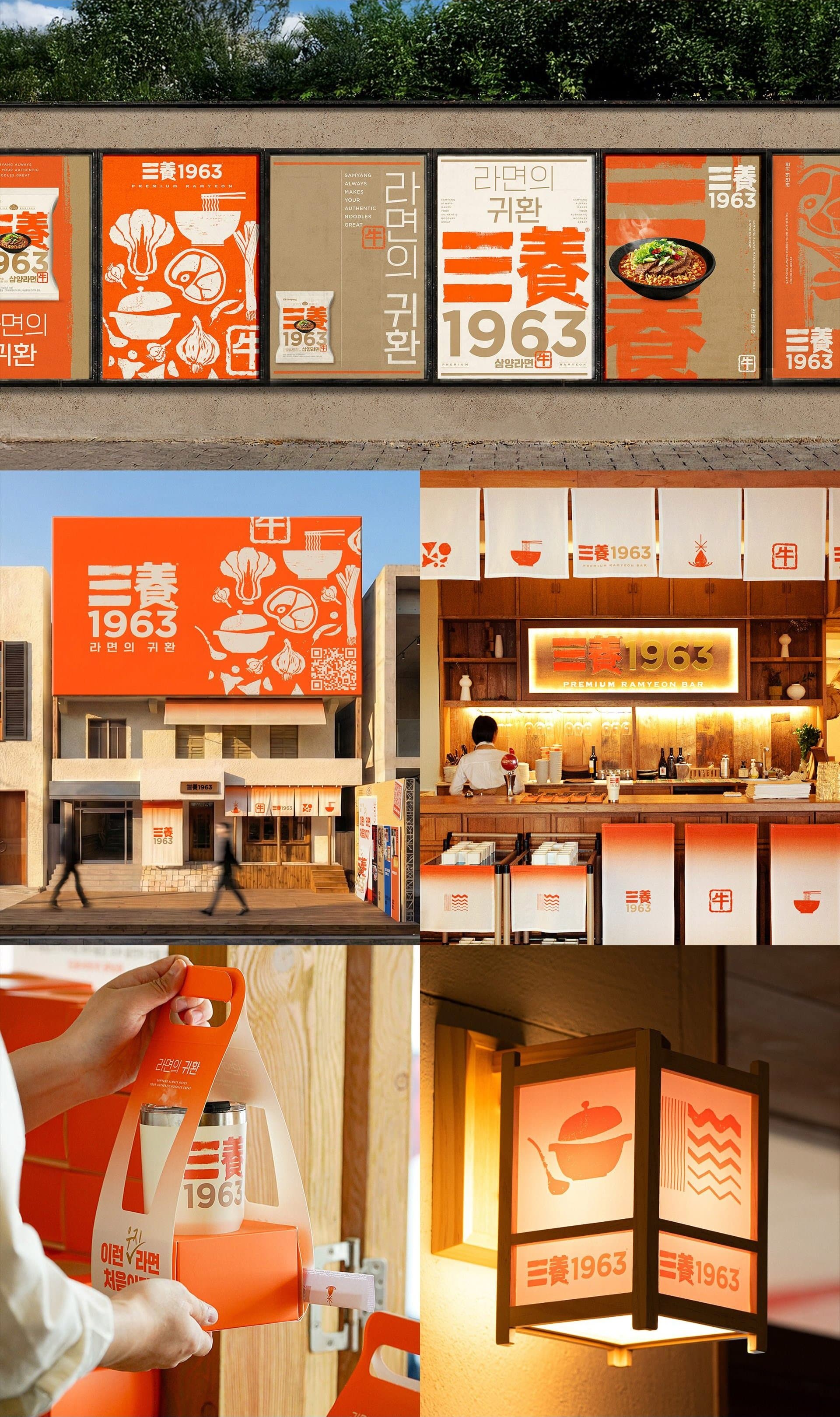
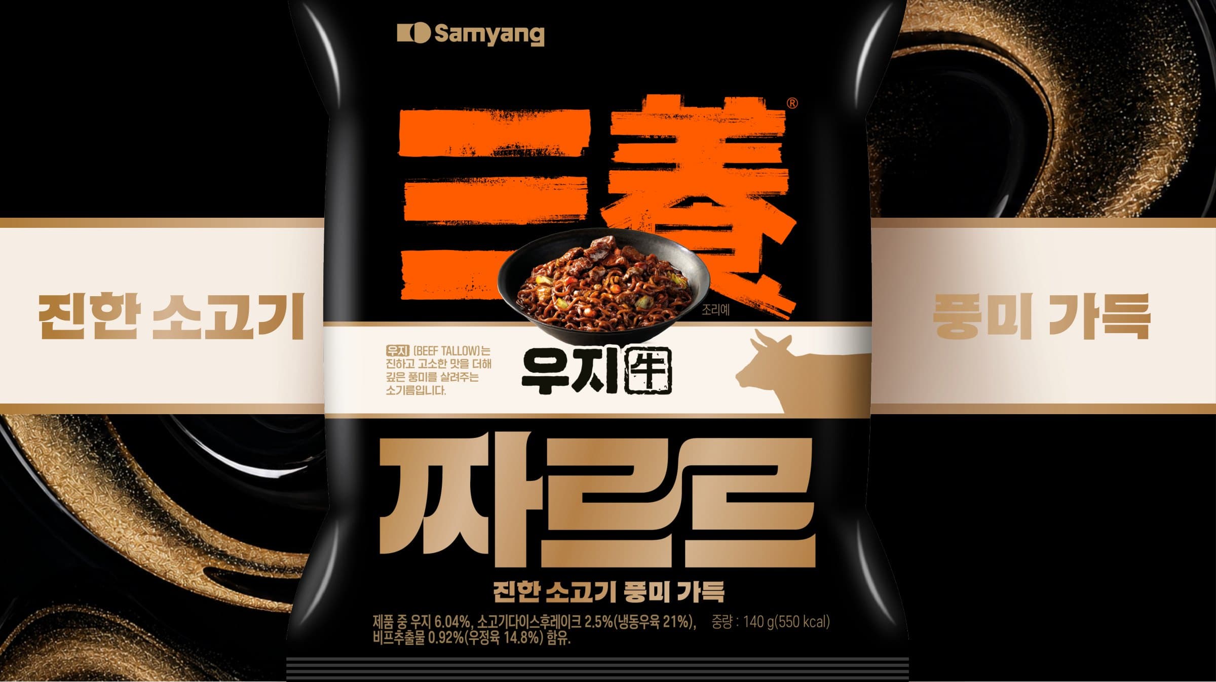
Visually, we avoided obvious retro cues. The bold SAMYANG wordmark, prominent 1963 and red seal motif gave the brand a sense of origin and authenticity, but in a deliberately contemporary way.
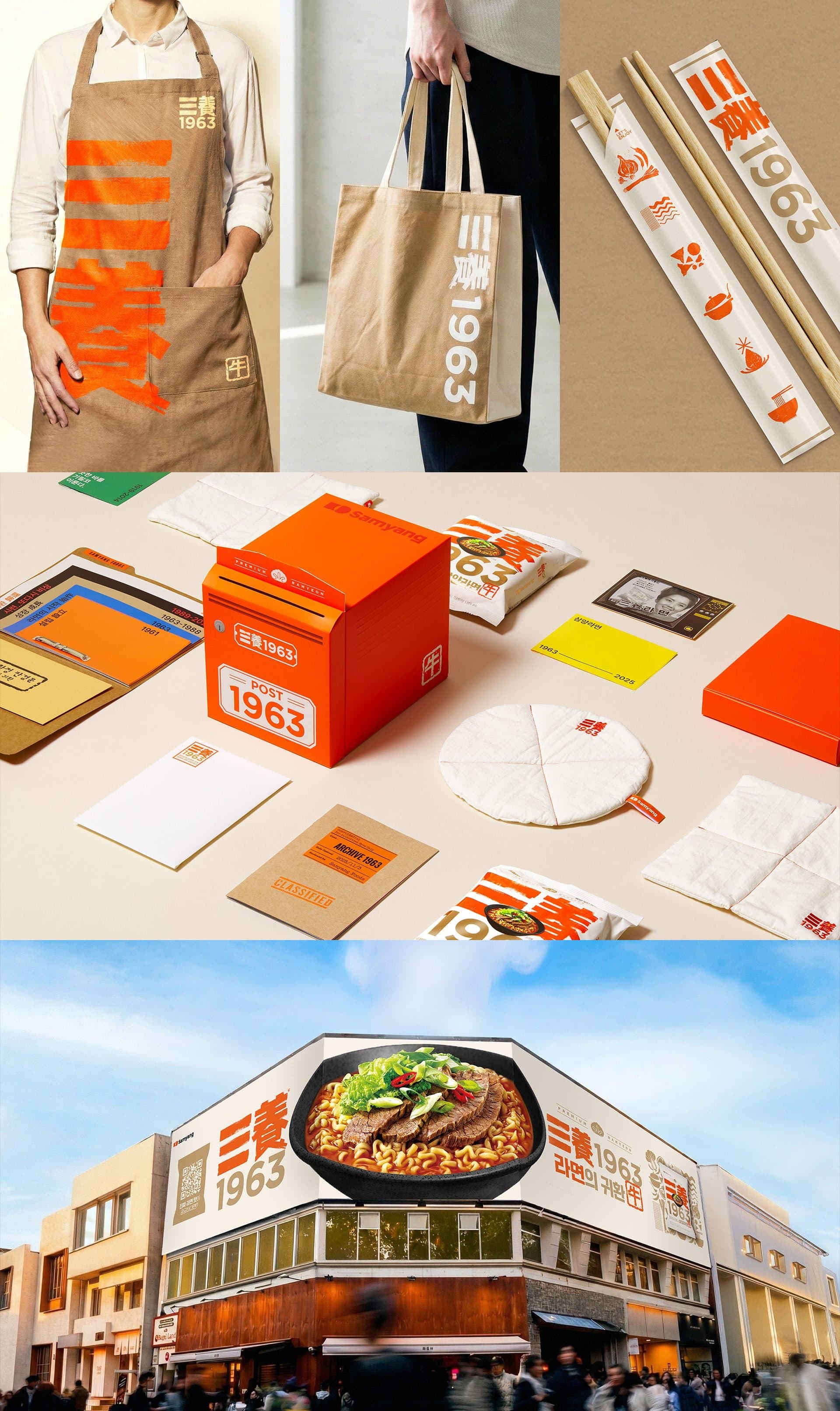
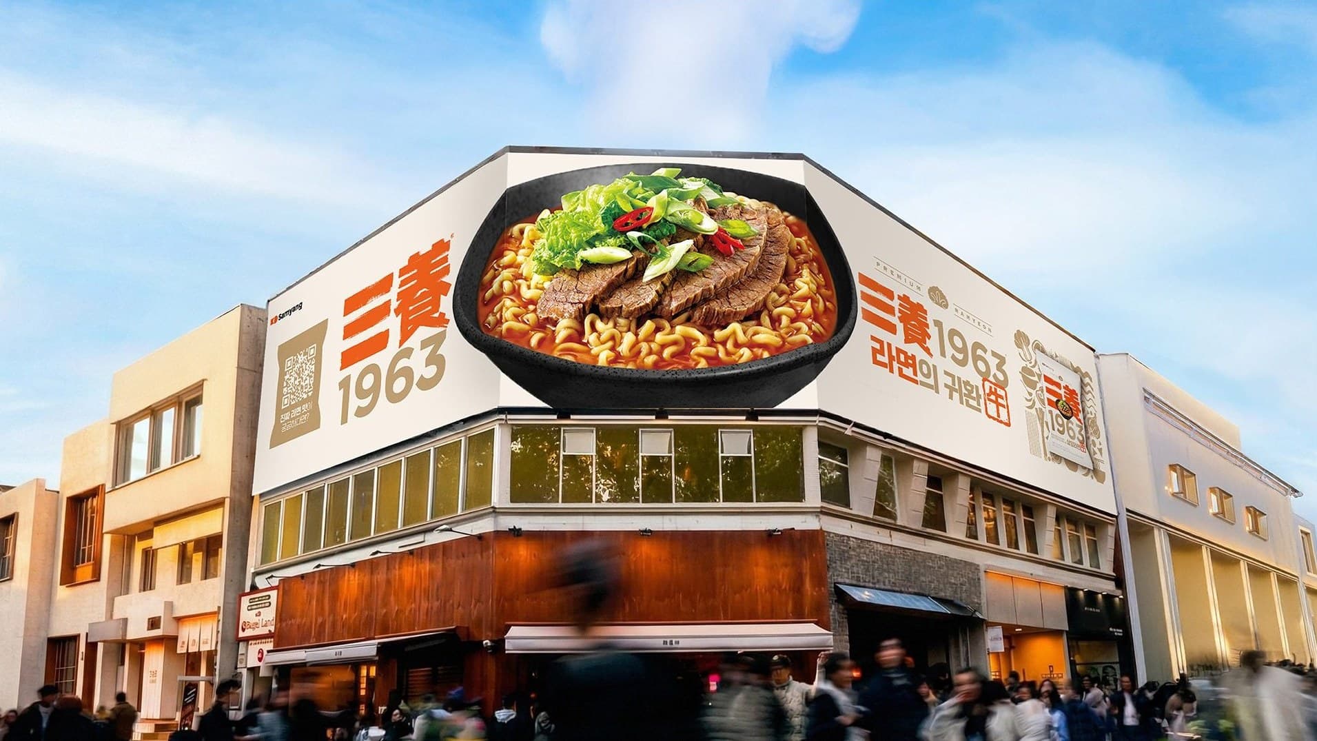
The same approach carried through launch communication, PR, outdoor and consumer experience.
Impact
Samyang1963 established a new premium expression of the Samyang masterbrand and brought an important part of the company’s history back into active use.
The launch generated strong early consumer response and substantial earned attention, while the packaging later received international design recognition.
More importantly, heritage became something the brand could build forward from — rather than simply look back on.
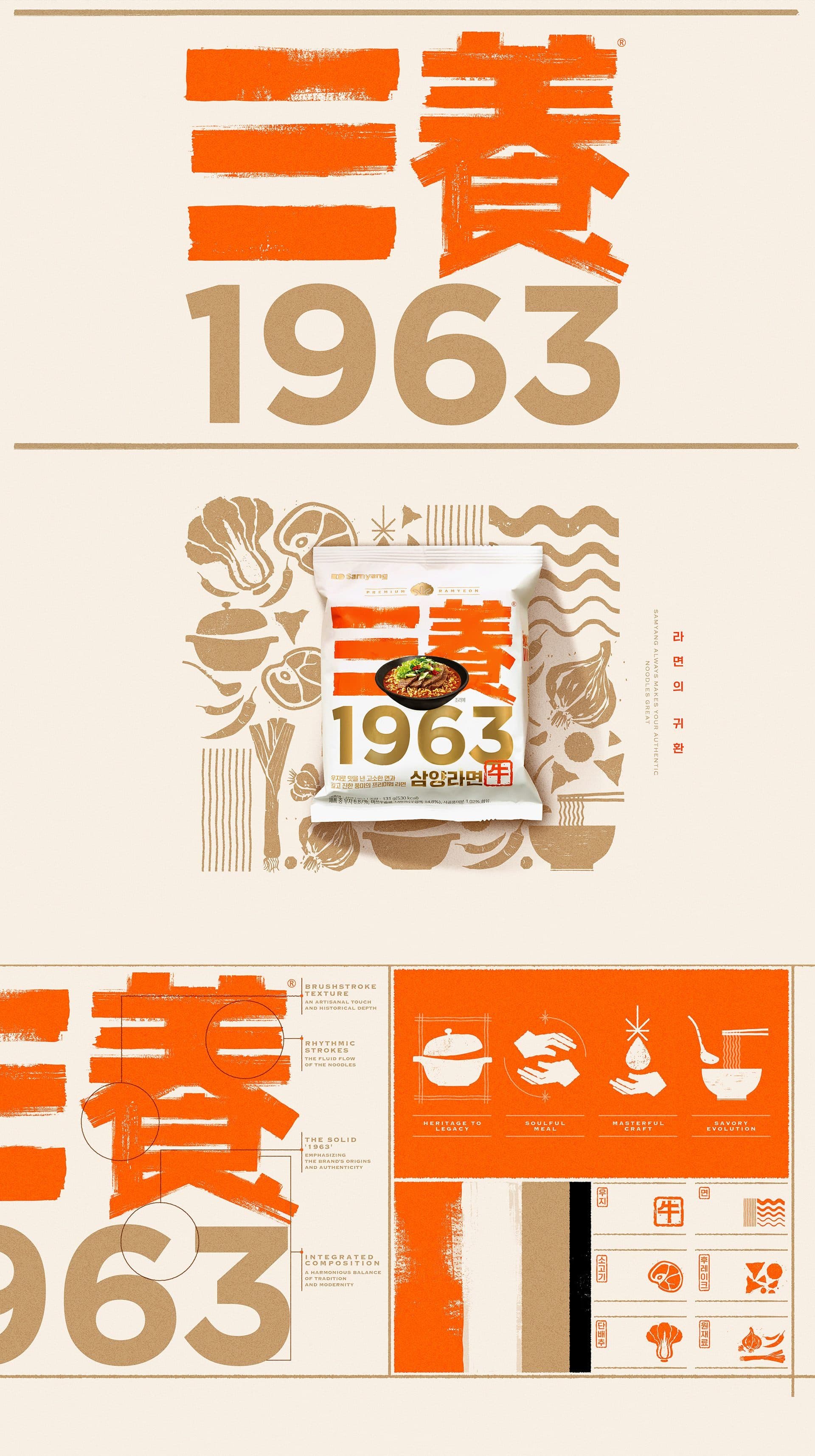
Every element of the visual identity is built to carry meaning. A bold SAMYANG wordmark, rendered in Sino-Korean characters, anchors the brand in its original mission — providing nourishment to the Korean public. The numeral 1963 asserts its place in history. A seal-like red motif bearing the Sino-Korean character for ‘cow’ ties the founding story to its core ingredient, beef tallow, in a single unambiguous mark. Together, these elements form a coherent symbolic system — one where each decision reinforces the next, and the whole communicates more than the sum of its parts. A disciplined color system reinterprets Samyang’s signature orange — evoking continuity, warmth, and vitality — while unifying the richness of the brand’s visual world.
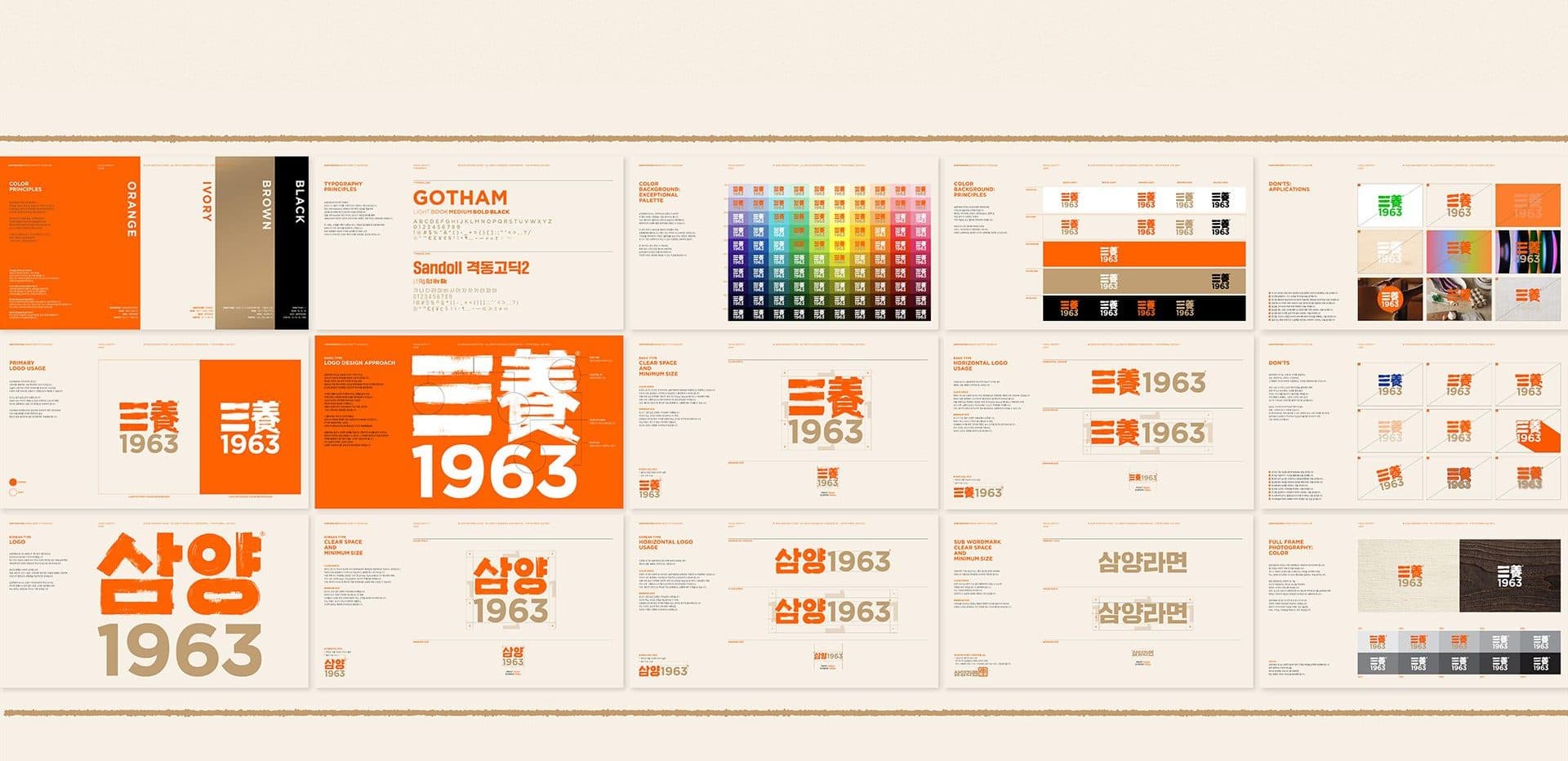
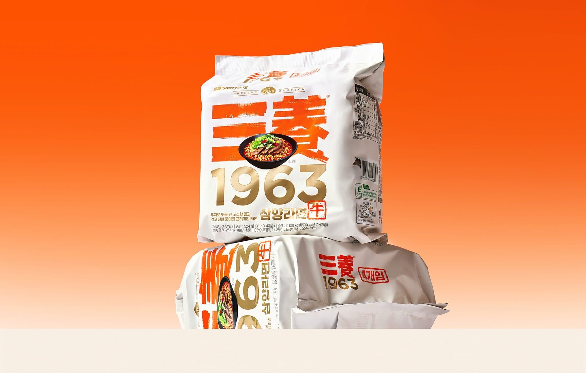
Samyang1963 is a packaging design that reinterprets the origins of Korea’s first instant ramyeon through a design language rooted in authenticity and restraint rather than nostalgia. The design positions the brand’s heritage as its strongest visual asset. The SAMYANG logotype, expressed with bold brushstroke lettering, the boldly displayed ‘1963’, and the red seal-inspired motif representing the Sino-Korean character for ‘cow’ serve as the package’s defining elements. Rather than functioning as decorative details, these components communicate the brand’s heritage with clarity and purpose, coming together to establish a clean yet distinctive visual identity. Refinement is achieved through reduction rather than addition. Generous white space, a disciplined grid system, and carefully organized information create a sense of balance and refinement, while Samyang’s signature orange, paired with restrained gold foil accents, bridges the brand’s heritage with a contemporary aesthetic. Samyang1963 is a design that prioritizes the brand’s history and essence over ornamental expression, expressing the brand’s essence through thoughtful restraint.